Keywords
The key words are carefully integrated into the design, creating a logo that not only visually represents ArchiForma but also communicates its values and approach to architectural innovation.
Stylish
Reflected in the clean and aesthetically pleasing design of the squared shape and offset strokes.
Elegant
Evident in the overall composition, with a focus on simplicity and sophistication.
Precision
Emphasized through the squared shape and the meticulous carving out of rotated number 2, showcasing attention to detail.
Dynamism
Showcased through the offset strokes, conveying a sense of adaptability and creativity in facing architectural challenges.
Structure
Symbolized by the solidity of the center, conveying strength and reliability in architectural solutions.
Innovative
Represented by the carved-out number 2 and the overall modern, cutting-edge design.
Modern
The contemporary nature of the design aligns with the modern aspect, especially in the use of shapes and negative space.
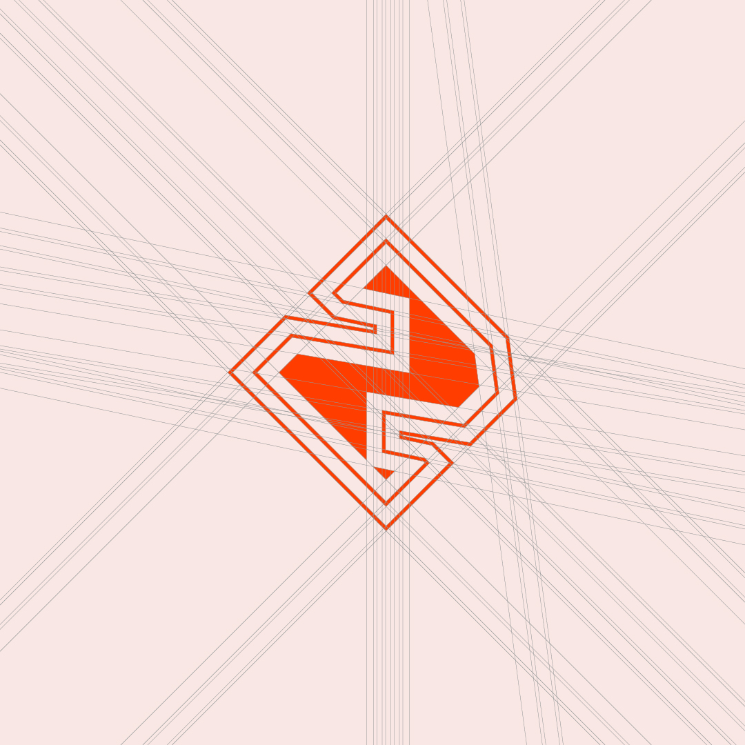
Logo Rationale
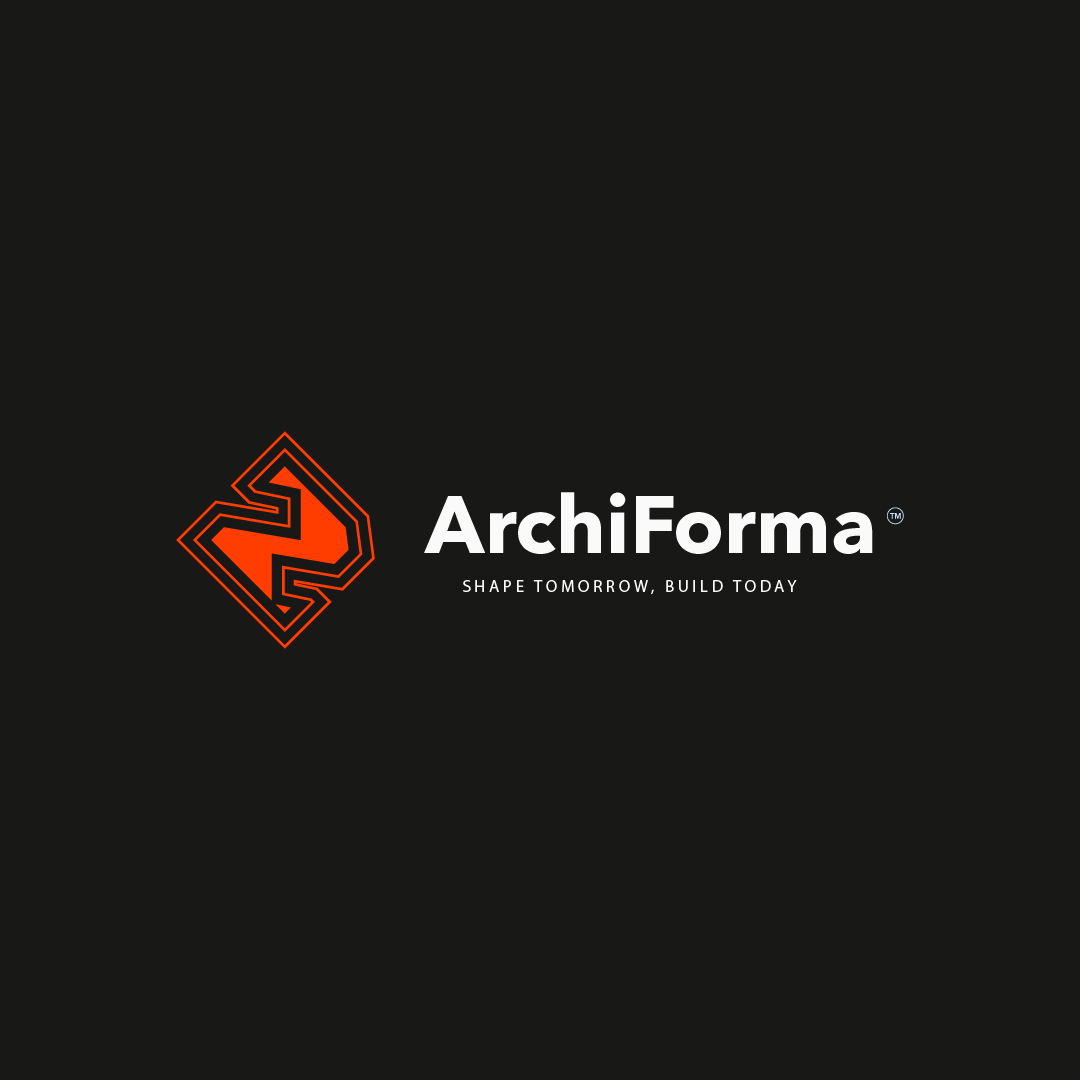
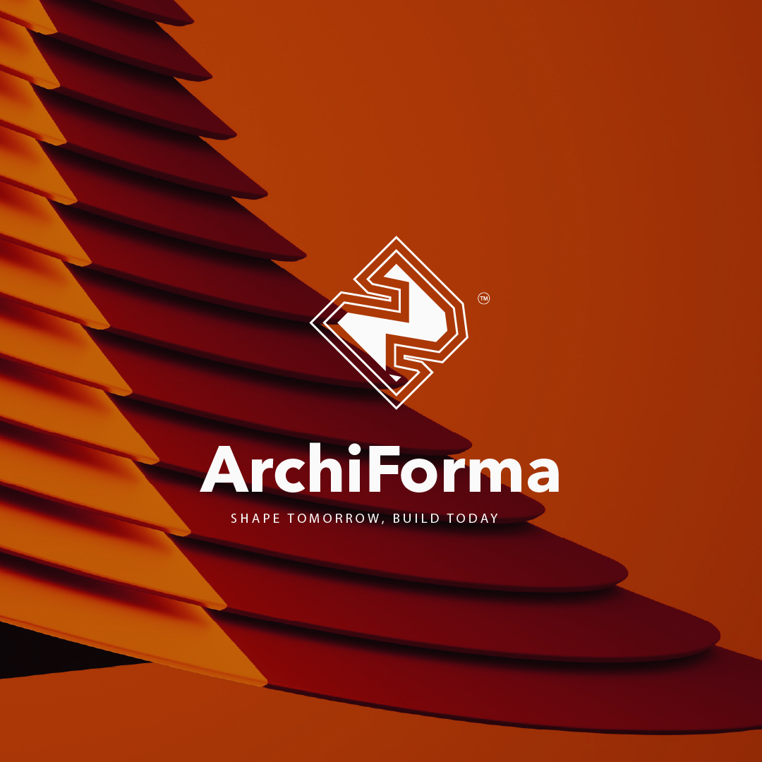
The ArchiForma logo embodies the brand’s commitment to stylish and elegant architectural solutions. The squared shape represents precision and structure, aligning with the meticulous attention to detail that ArchiForma brings to its projects.
The carved-out, rotated number 2 signifies the firm’s focus on innovative design and modern aesthetics. The offset strokes symbolize dynamism and adaptability, showcasing ArchiForma’s ability to navigate diverse architectural challenges. The solid center represents the core strength and reliability of the brand. Overall, the logo seamlessly blends modernity with sophistication, reflecting ArchiForma’s position at the forefront of architectural innovation and design excellence.
