Introduction
A good trademark is not about what one likes or dislike; it’s about what works.
In otherwords we try to put aside personal preferences when we judge this things, we try to be objective and focus on functionality because if it works you will like it with time.
How do we define what works?
Appropriate
The logo should be appropriate to the brand or organization it represents. It should reflect the company’s values.
Memorability
A strong logo is memorable and leaves a lasting impression on people’s minds. It should be distinctive and unique, enabling it to stand out among competitors. A memoravle logo helps create brand recognition an recall.
Simplicity
A successful logo is simple and easilyrecognizablewlt should be visually appealing and convey the intended message in a clear and coincise manner.
About
Fun
At Bangkok Fitness Center, we believe that fitness should be enjoyable and engaging. Our certified trainers design dynamic workout routines and classes that make exercising a fun and rewarding experience. From energetic group fitness sessions to exciting challenges and events, we strive to keep our members motivated and looking forward to their next workout.
Helping
We are committed to helping our members achieve their fitness goals, Our knowledgeable and approachable staff is always available to assist you in creating personalized workout plans, offering nutritional advice, and providing the support needed throughout your fitness journey.
Quality
At Bangkok Fitness Center, we prioritize quality in every aspect of our services. Our state-of-the-art equipment and facilities are maintained to the highest standards, ensuring a safe and effective workout environment. We also invest in the ongoing training of our staff, ensuring they stay up-to-date with the latest fitness trends and techniques.
Honesty
Transparency and honesty are vital values in our business. We are upfront about our pricing, membership plans, and services. Our team is committed to delivering what we promise, and we value open communication with our members, addressing any concerns or feedback with integrity.
Community
Bangkok Fitness Center is more than just a gym; it’s a community. We foster a supportive and friendly atmosphere where members can connect with like-minded individuals, form friendships, and share their fitness journeys. We organize social events, workshops, and charitable initiatives to strengthen the sense of community among our members.
Creative Direction
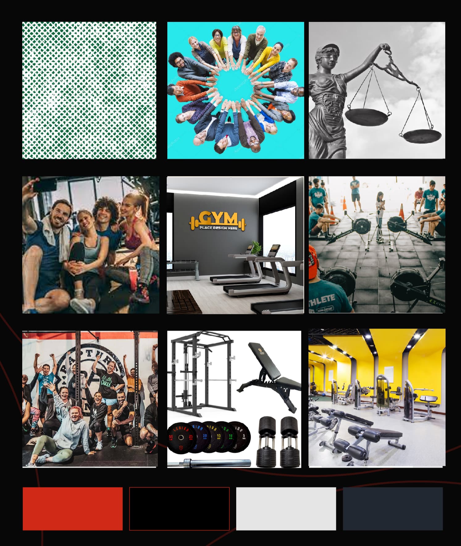
A mood board governs the visual cues that help to determine the overall look and feel of your brand and includes photography, logo styles, colours, textures and packaging. Community: Images of diverse people interacting, joining hands, and forming a circle symbolizing unity and inclusivity within the gym community.
Honesty: Elements that signify transparency and integrity, such as open books, scales of justice, and truthful symbols.
Fun: Illustrations of people laughing, engaging in enjoyable activities, and lively colors that evoke a sense of excitement and joy.
Illustrative Logo Sample: The logo design embodies the spirit of community, honesty, and fun at Bangkok
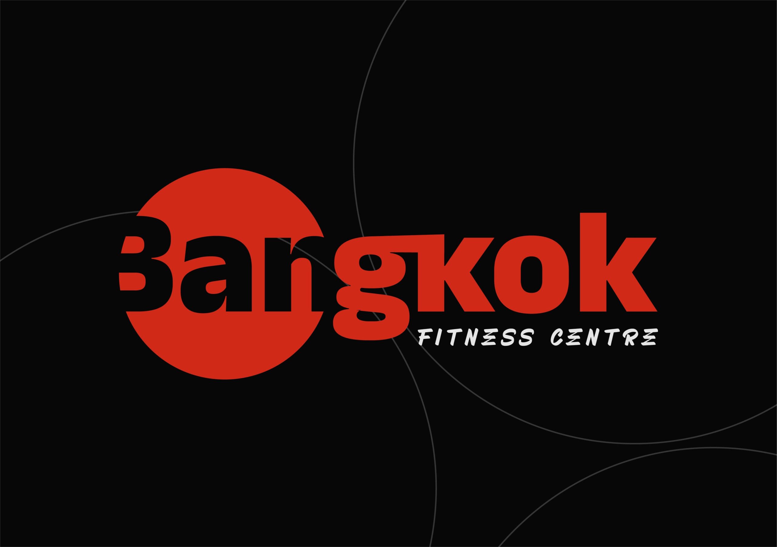
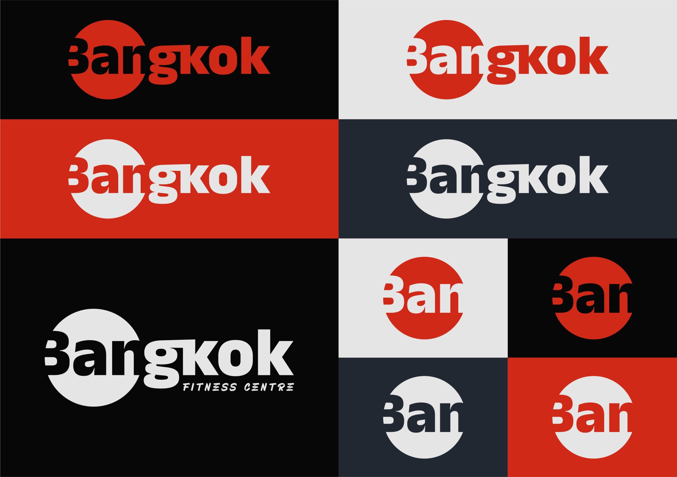
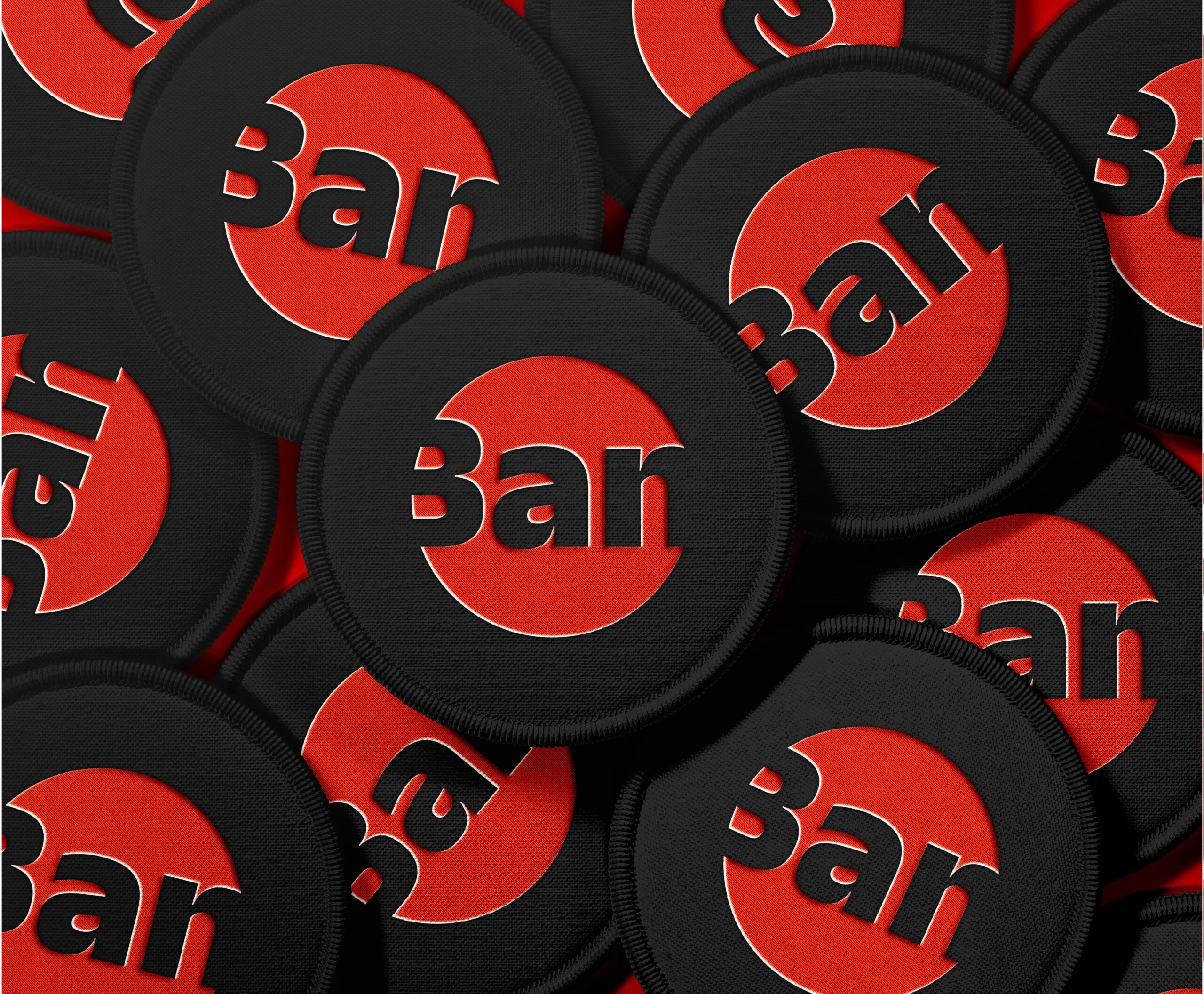
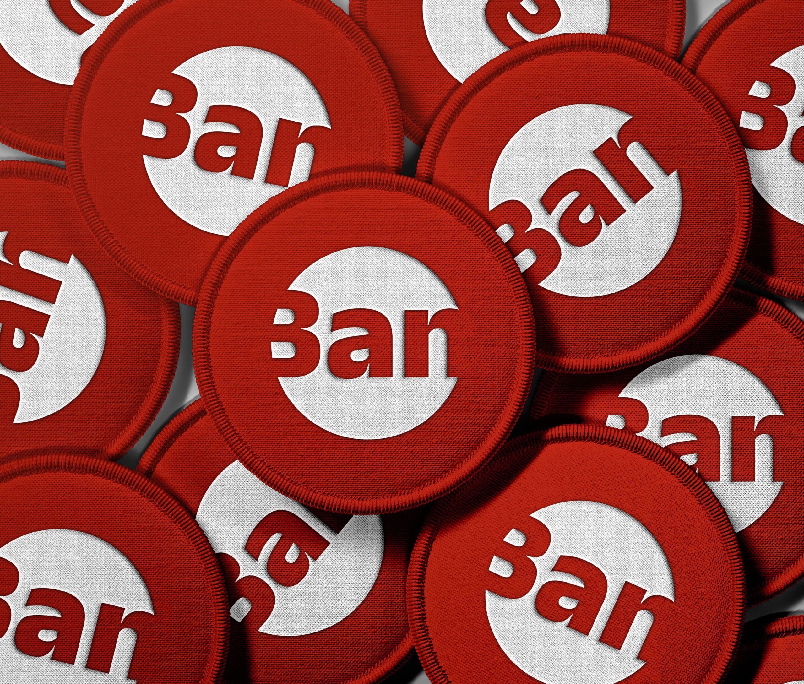
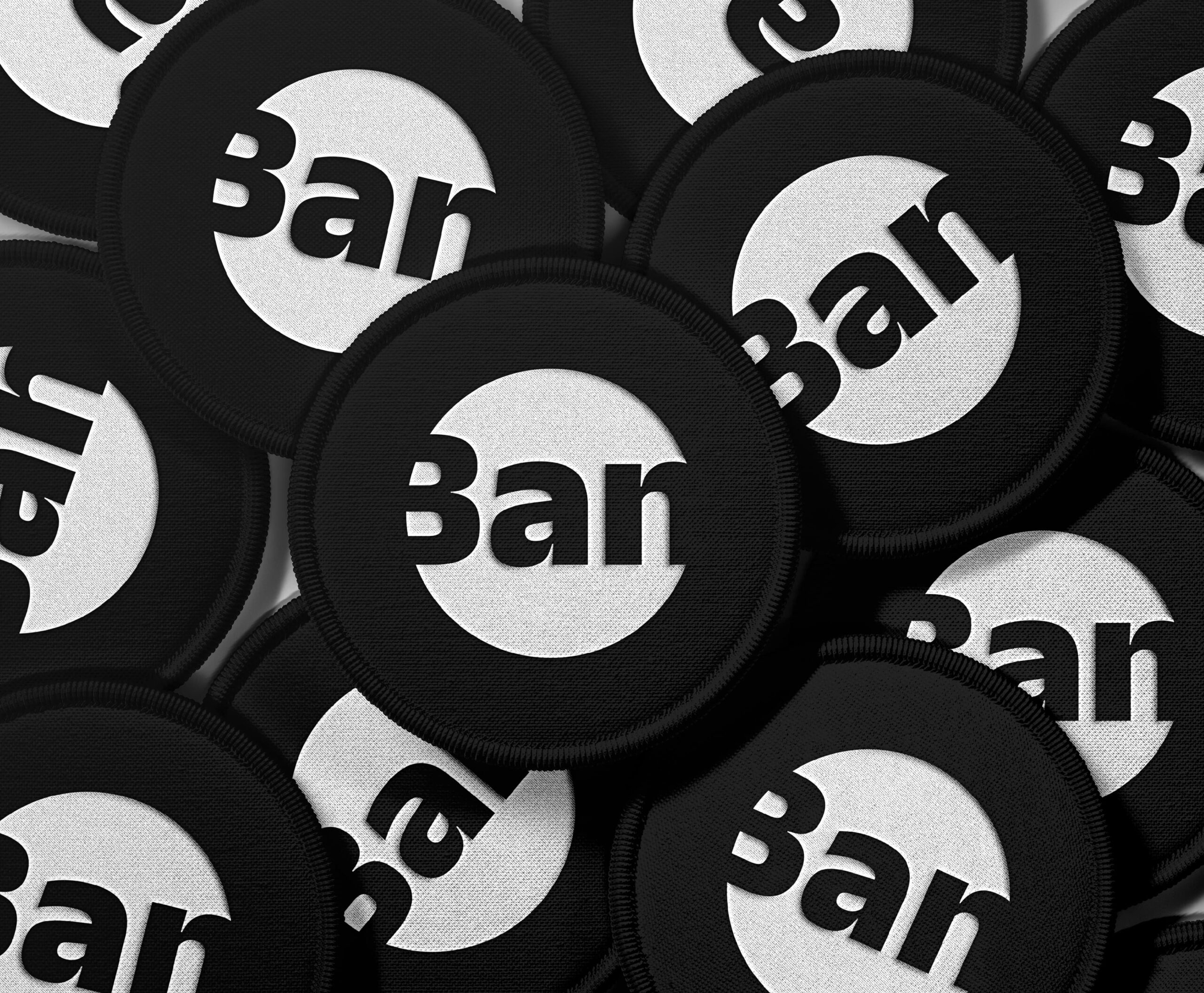
Fitness Center Icon: The logo icon proudly showcases a circle artfully integrating the word “BAN” as negative space, brilliantly emphasizing the significance of honest advice to attain gyming objectives. Simultaneously, the circle and bold sans-serif font synergistically embody the essence of a robust and inclusive community
Brand Attribute
- Fun
- Honesty
- Community
Logo Rationale
The logo’s design rationale revolves around two key elements: a circle with the word “BAN” as negative space and a bold sans-serif font. These choices serve a dual purpose in effectively conveying the brand’s core message.
The Circle: The circle symbolizes inclusiveness and unity, reflecting the brand’s commitment to fostering a strong and supportive community. It conveys the idea that everyone is welcome, regardless of their background or fitness level, and that they can work together to achieve their fitness goals.
The Word “BAN” as Negative Space: By incorporating the word “BAN” within the circle as negative space, the logo cleverly emphasizes the importance of honest advice. It sends a clear message that the brand is dedicated to providing straightforward and transparent guidance to its audience, promoting a culture of trust and authenticity.
Bold Sans-Serif Font: The use of a bold sans-serif font adds a touch of modernism, professionalism, and strength to the logo. It communicates a sense of confidence and reliability, reinforcing the brand’s commitment to excellence in the fitness industry.
Overall, the logo’s design elements work harmoniously to express the brand’s values of inclusiveness, honesty, and strength, making it an impactful representation of the brand’s identity and objectives.
Brand Logo
Brand Colours
Brand Typography
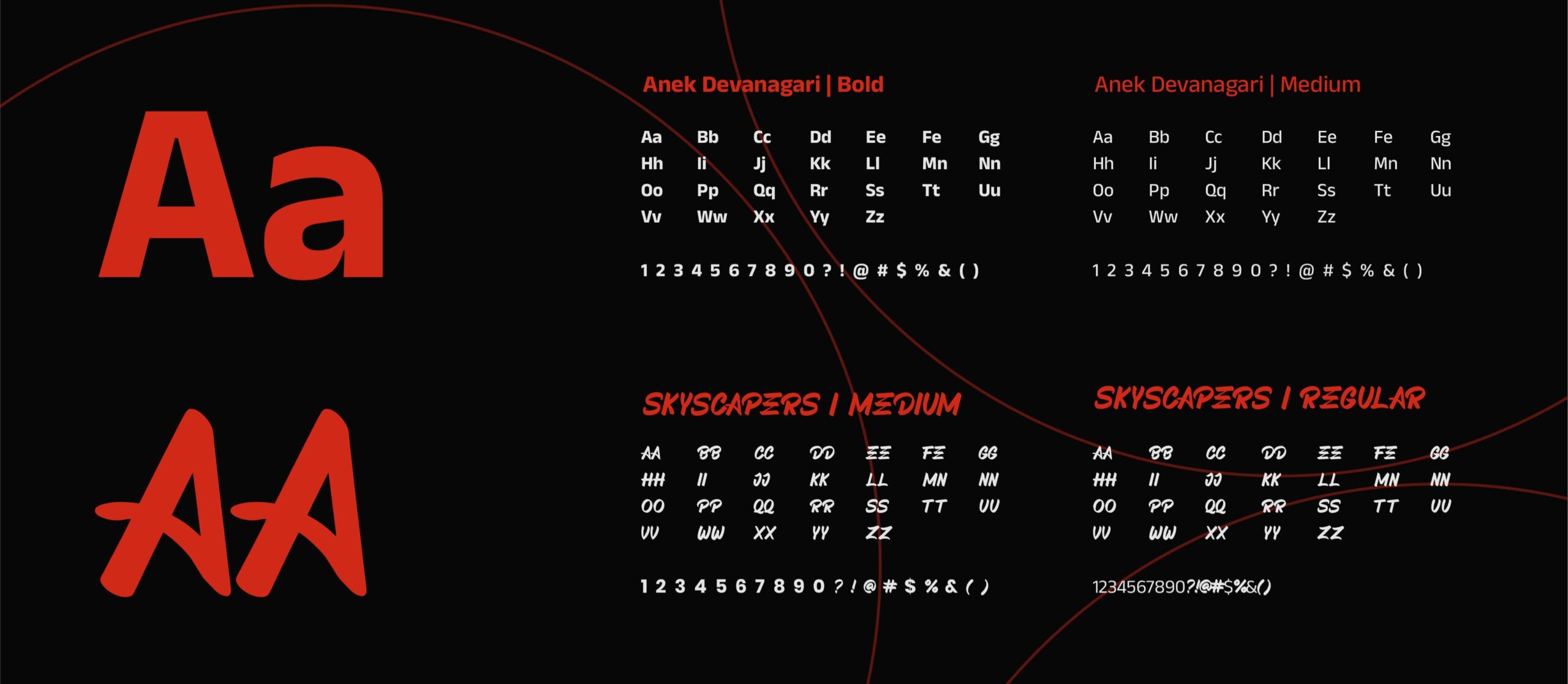
The primary font used in this brand project is custom made but similar to Anek Devanagari and the secondary font is SKYSCAPERS. Both of these fonts are combination of sans-serif category which has a modern impression, so they were chosen because they were considered capable of representing some of the characteristics of BANGKOK FITNESS CENTRE..
Brand Iconography
Brand Pattern



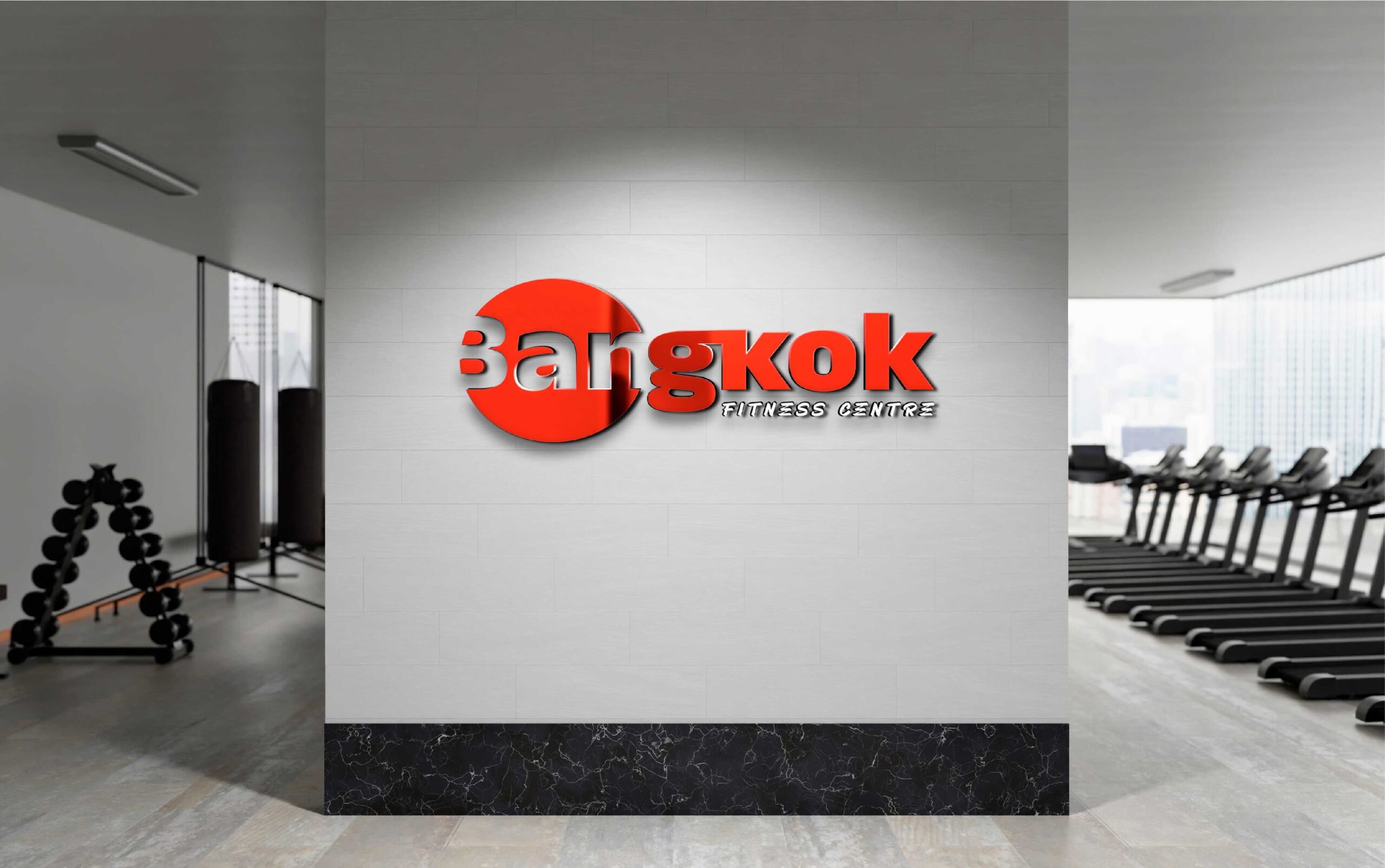
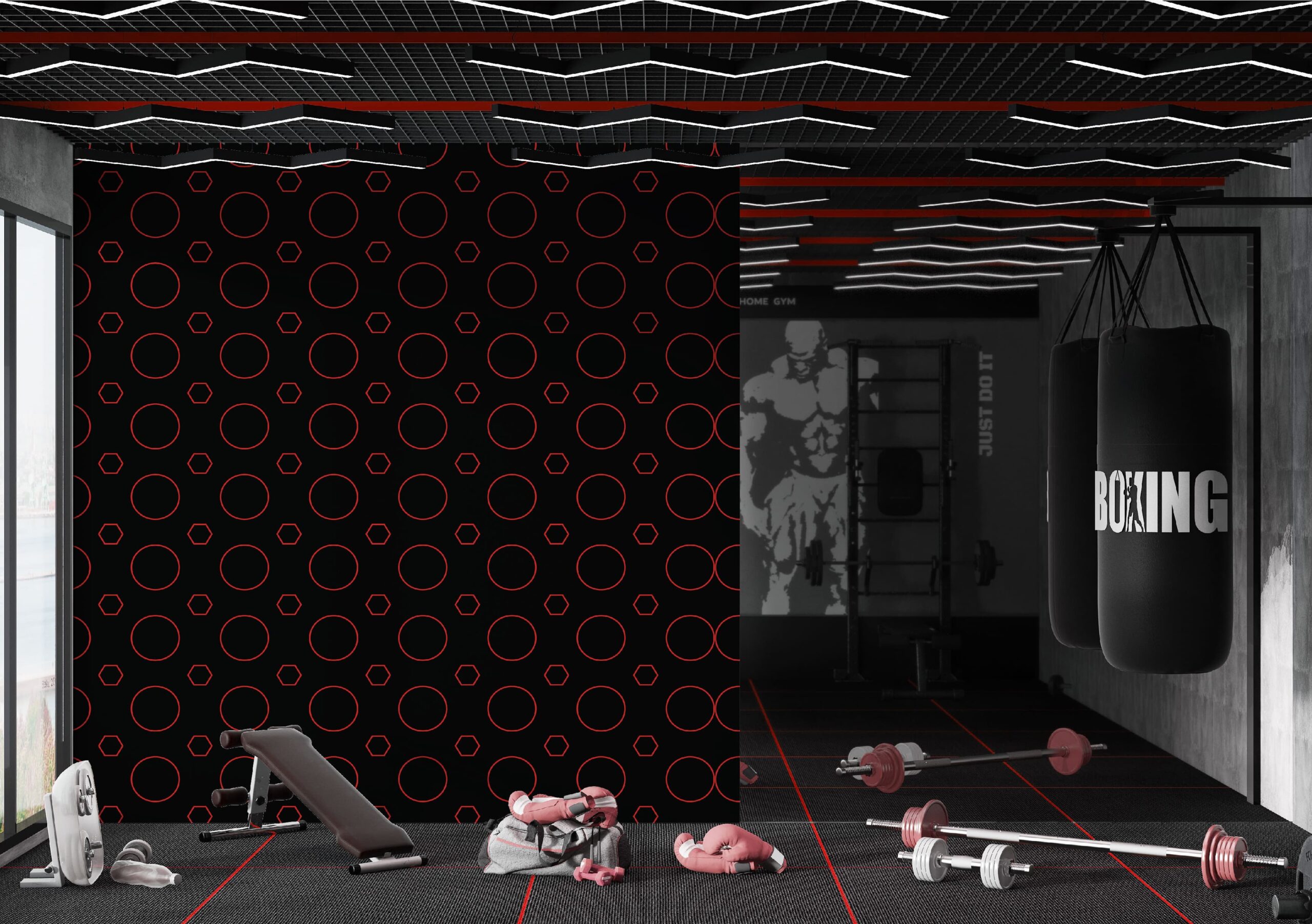
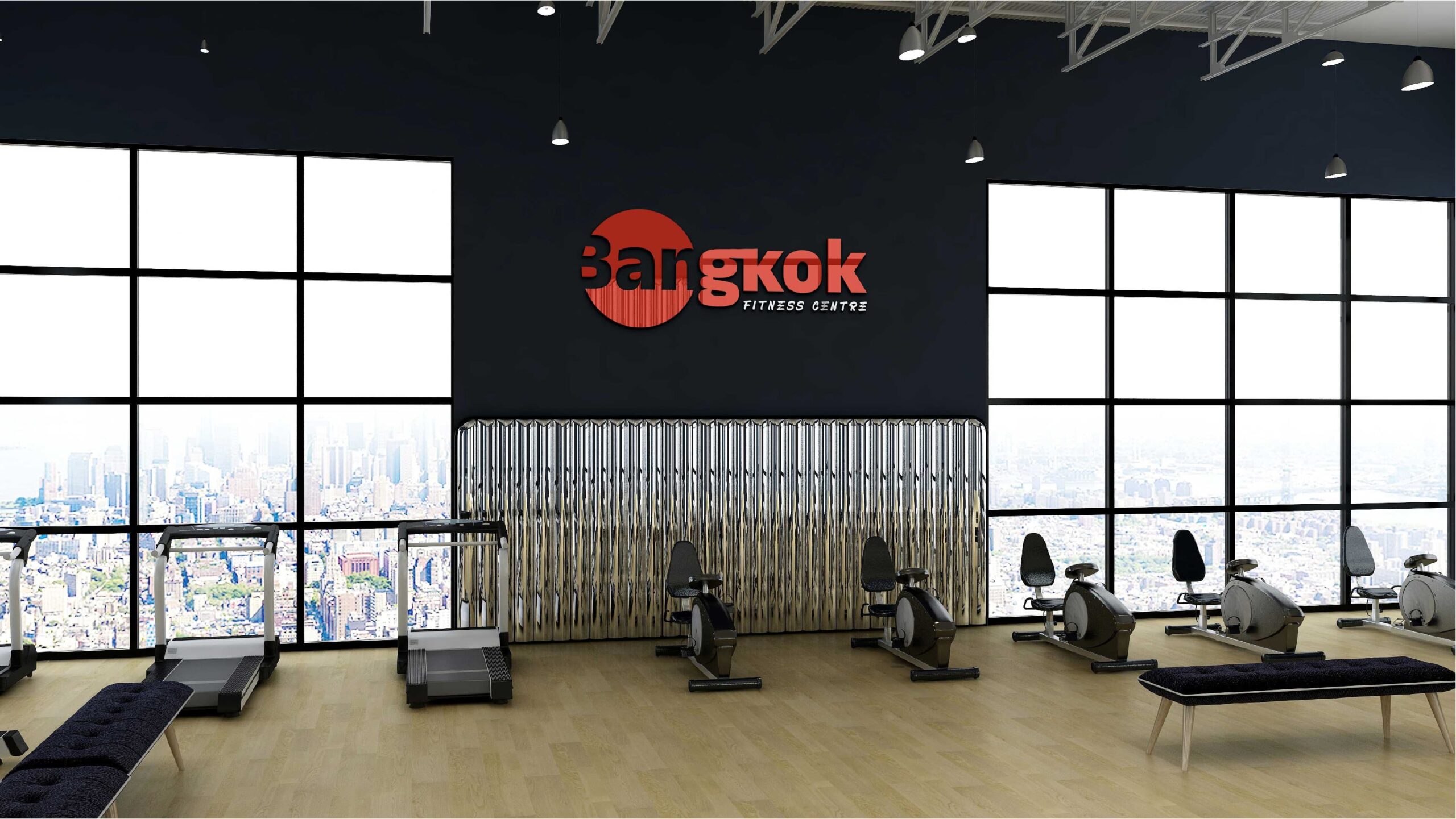
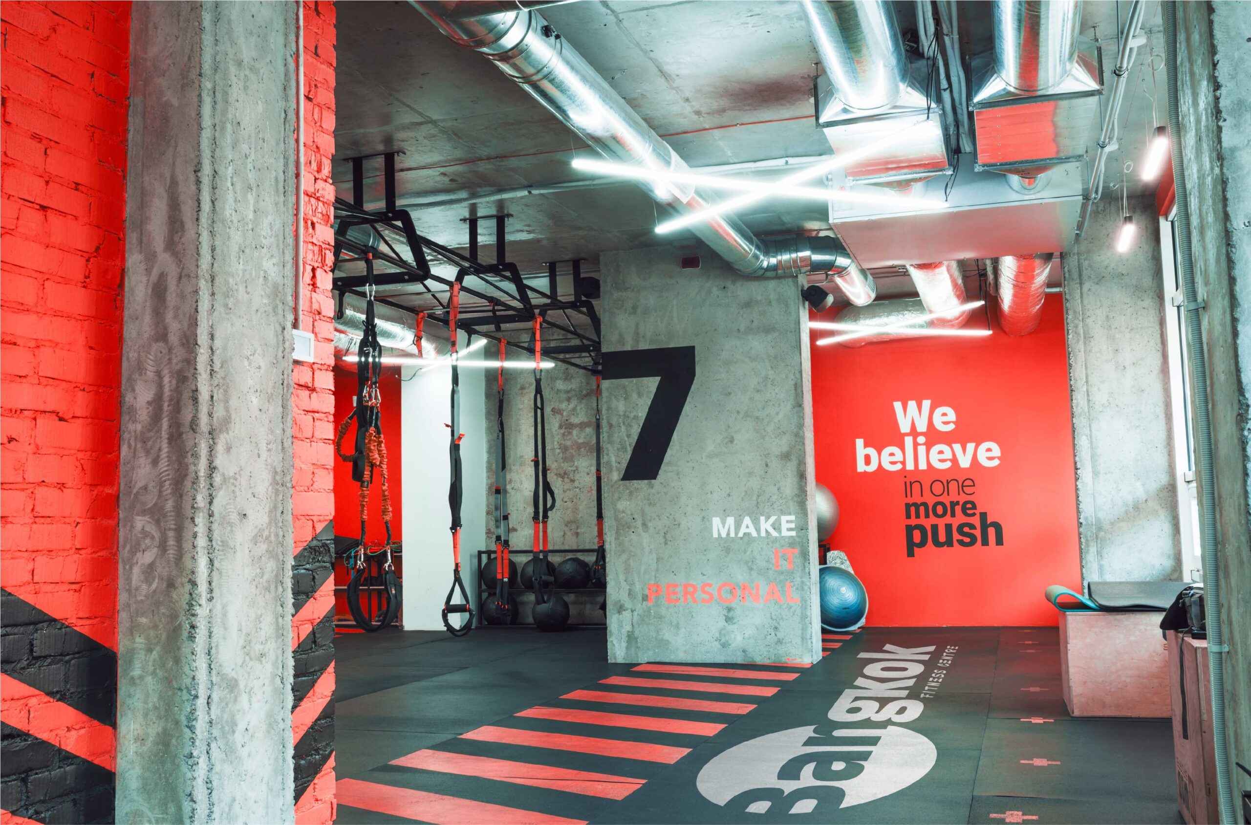
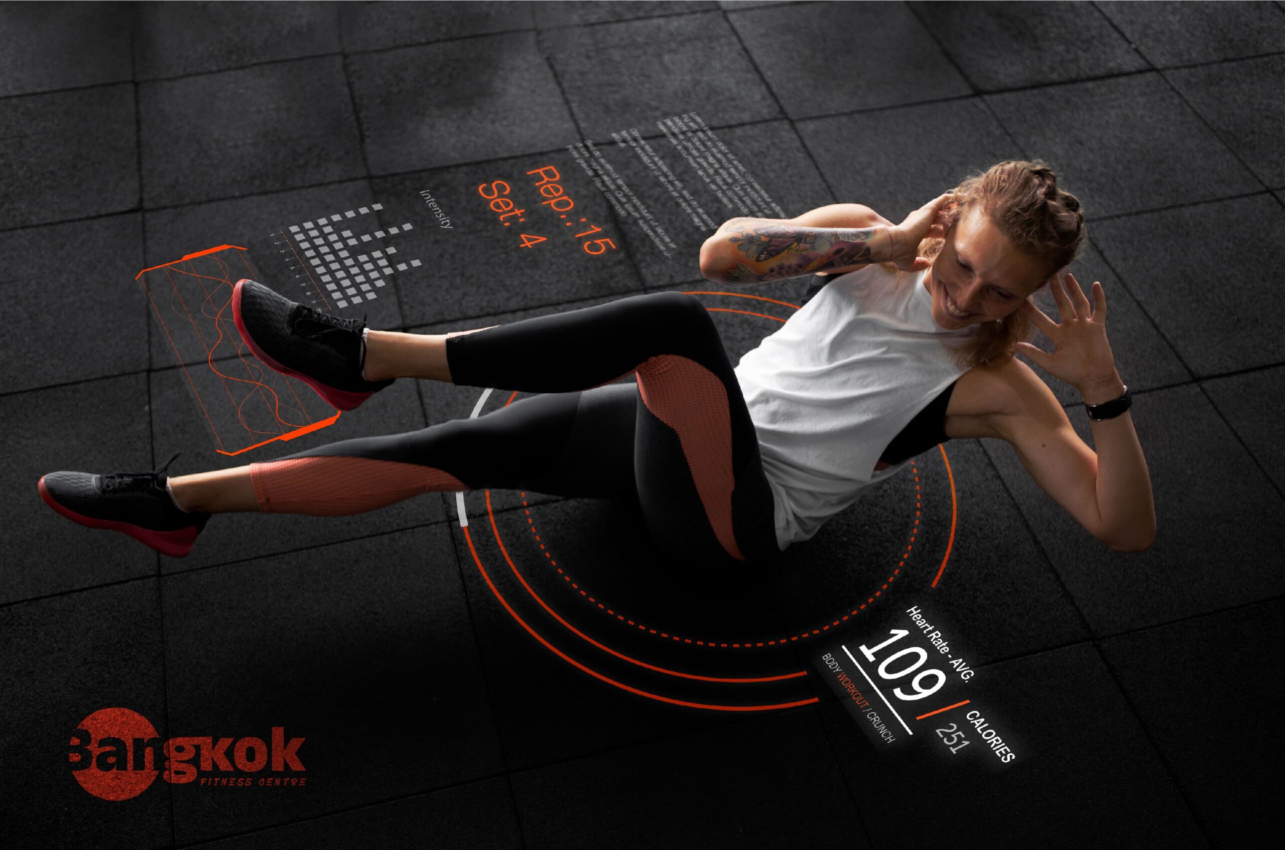
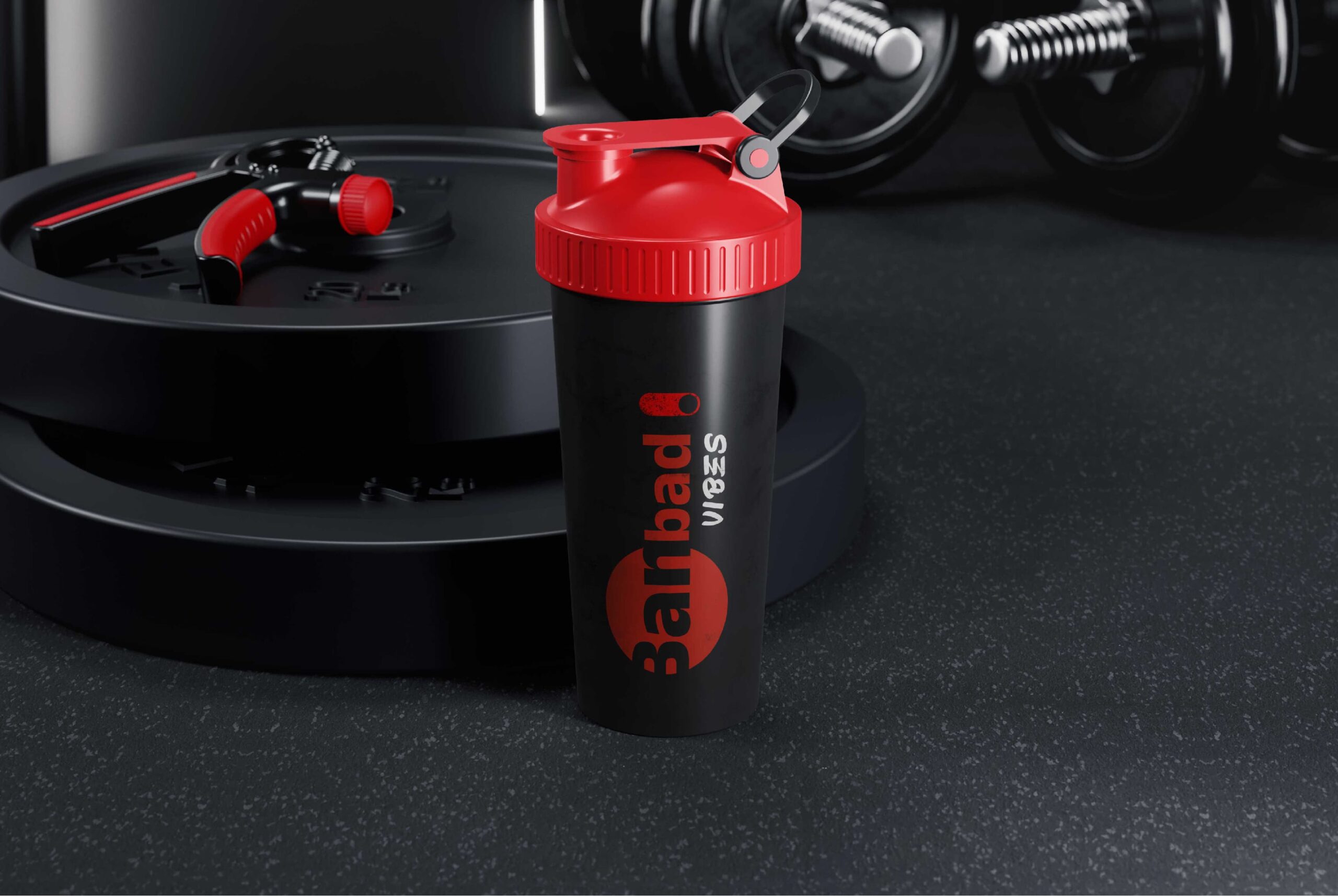
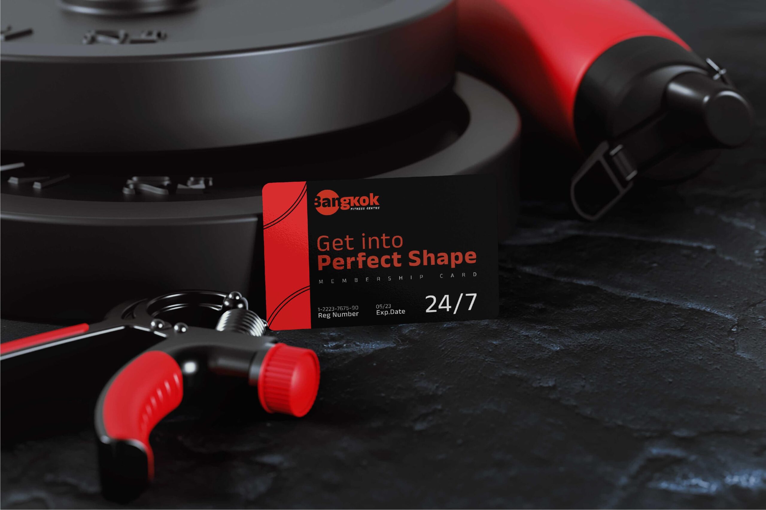
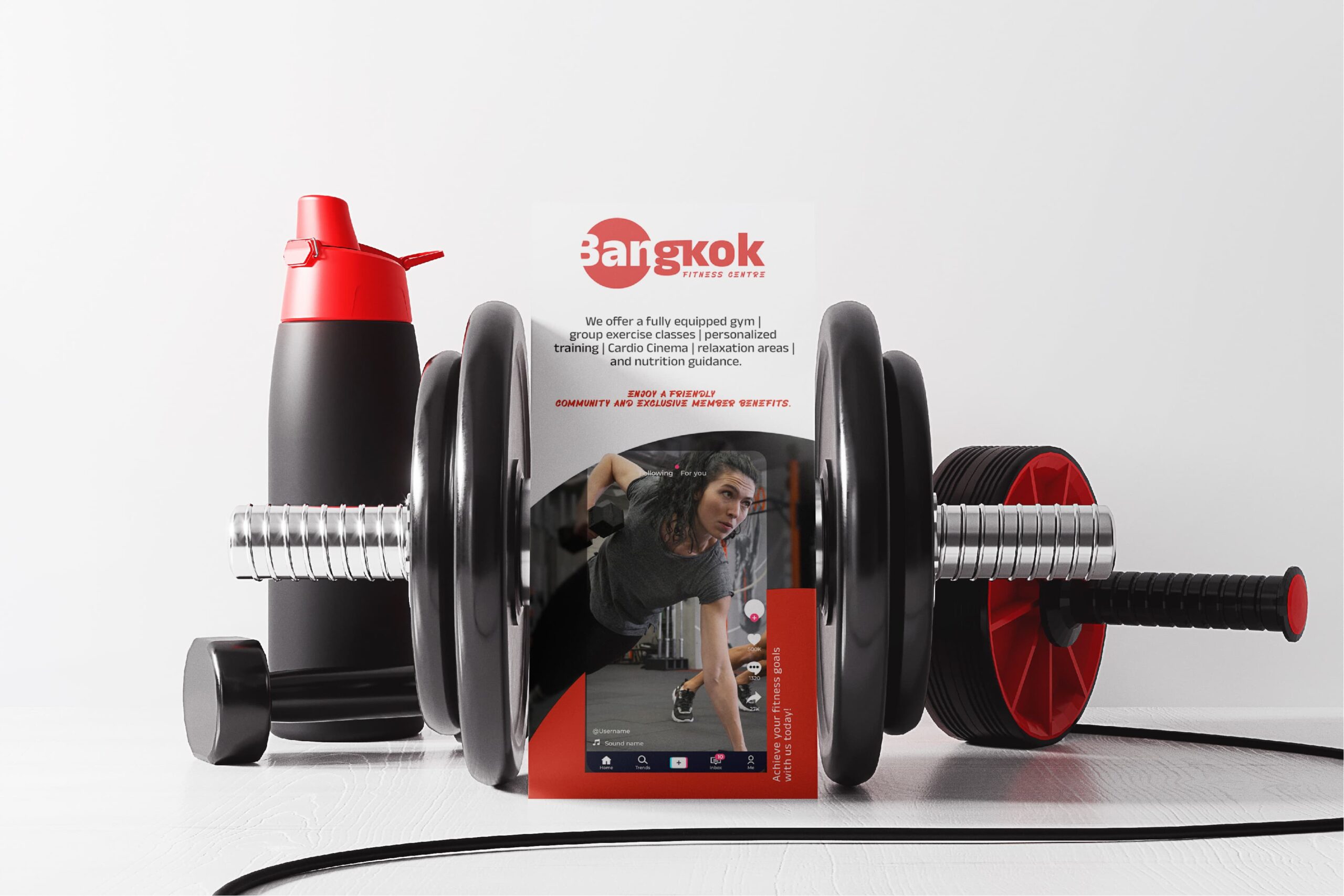
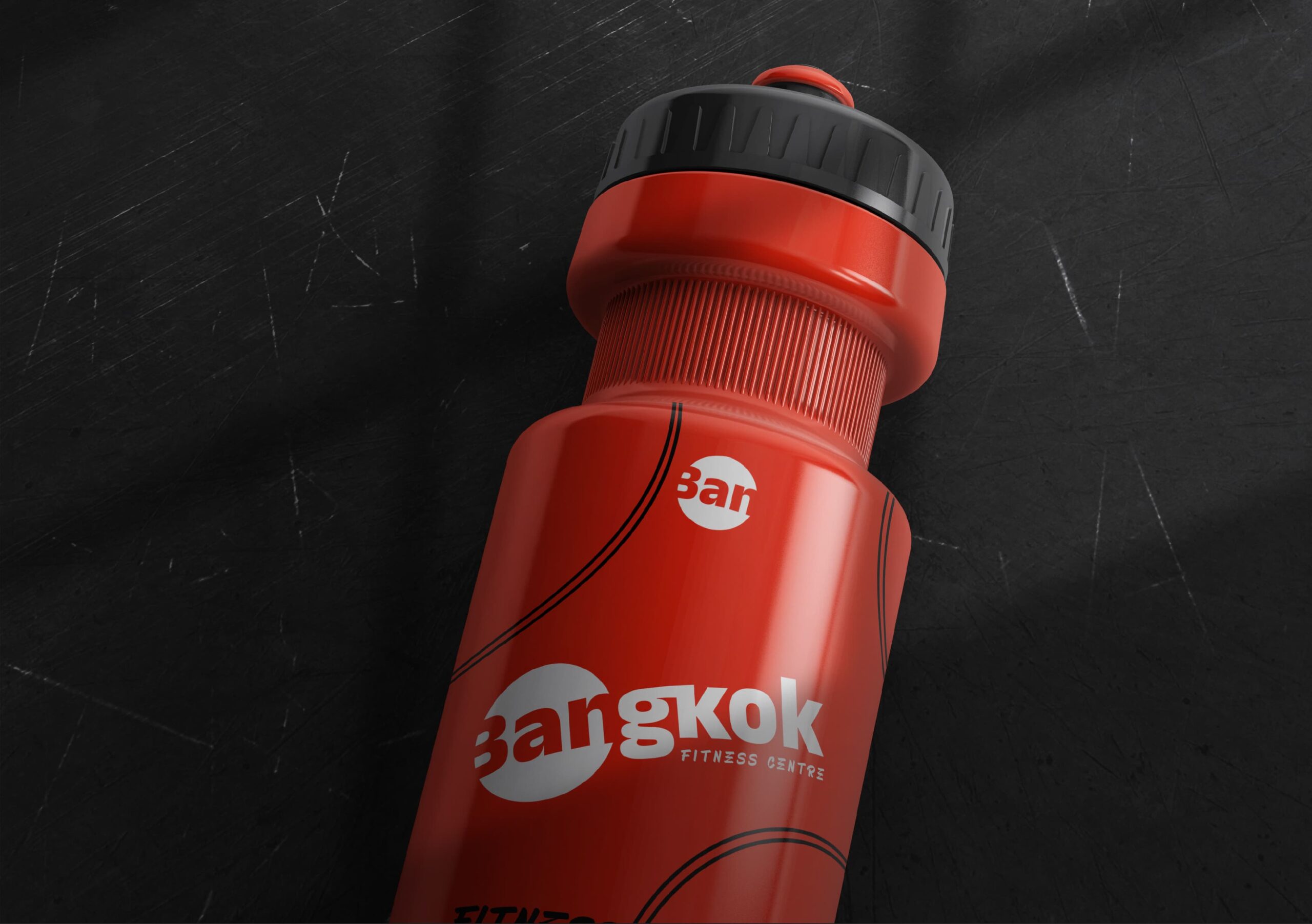
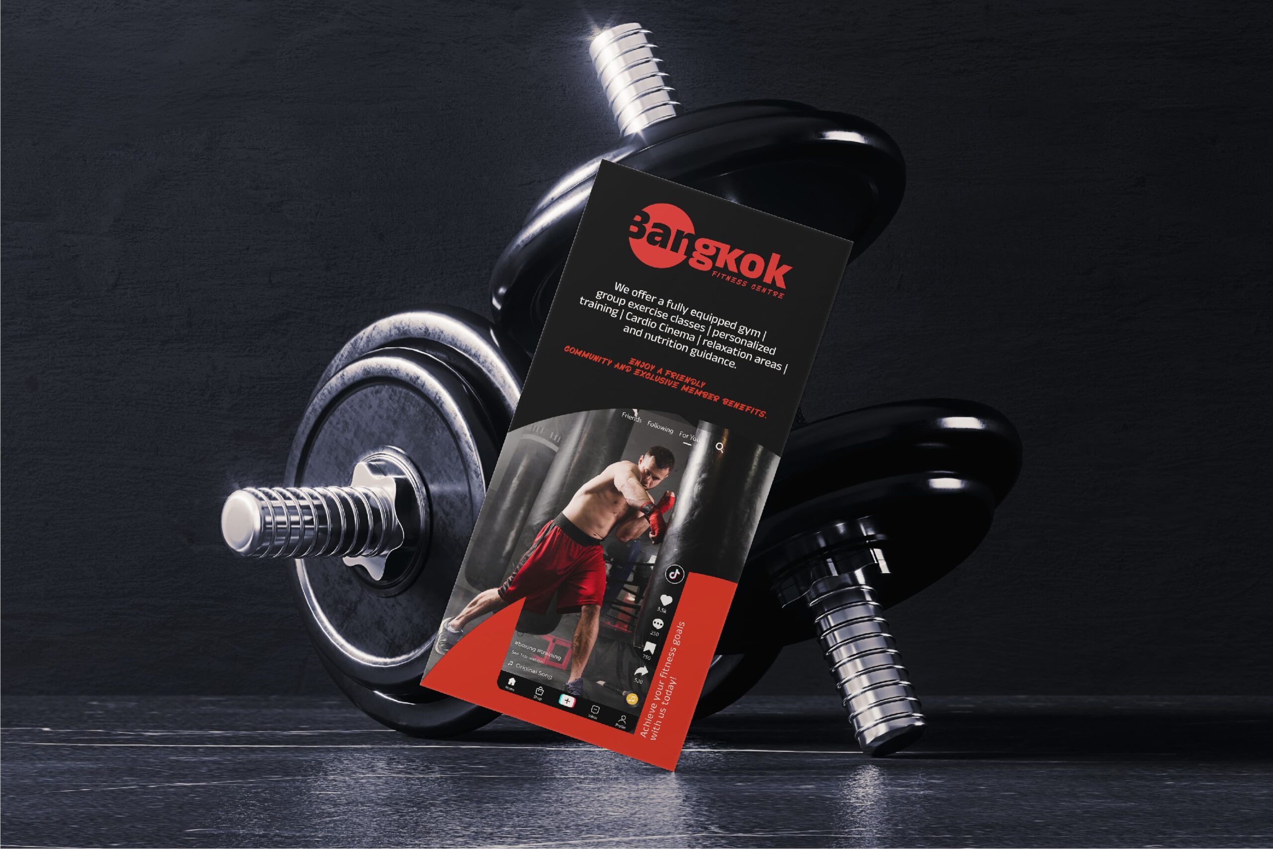
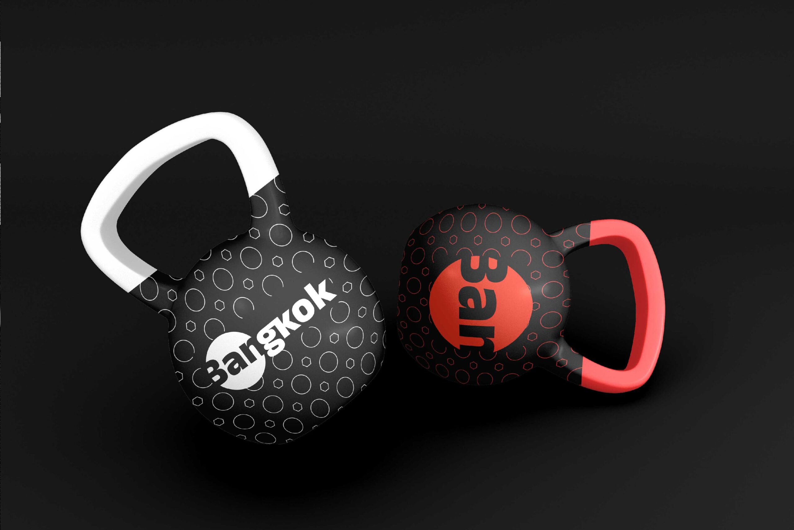
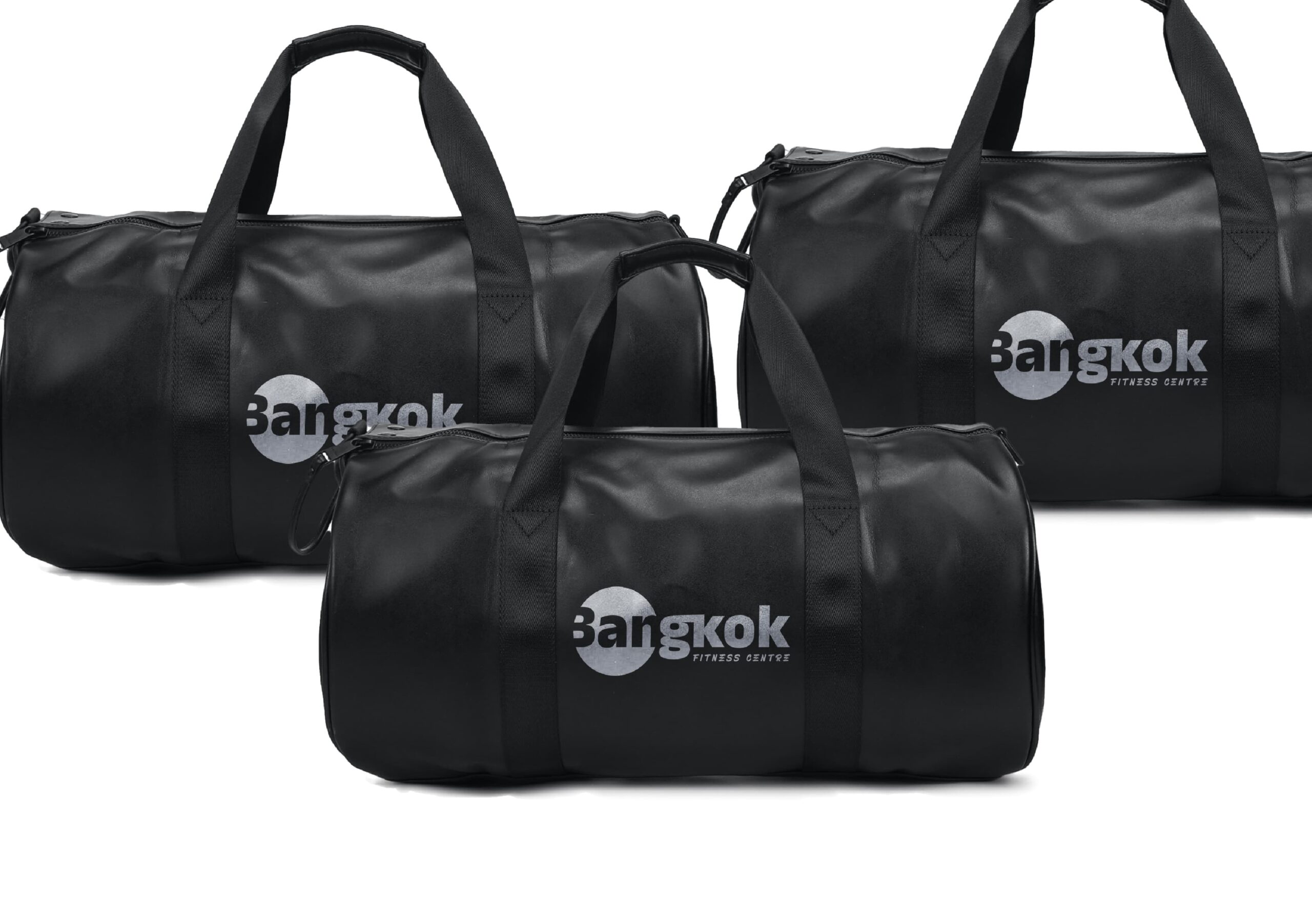
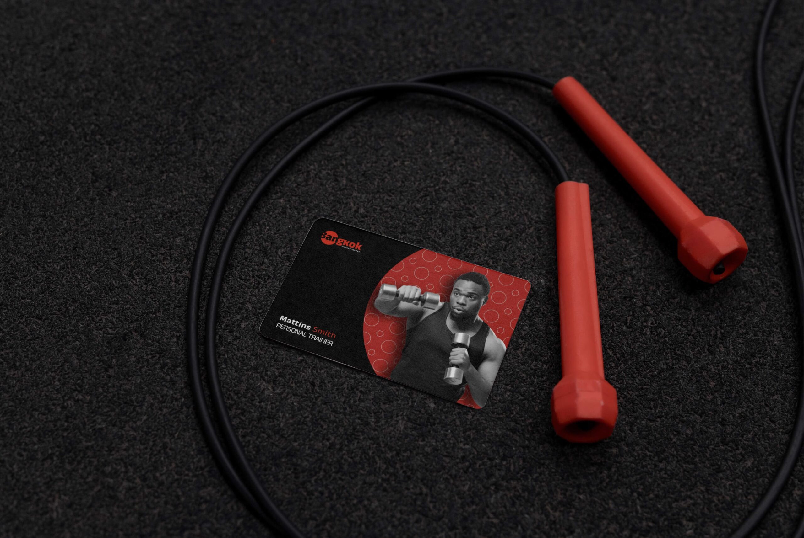
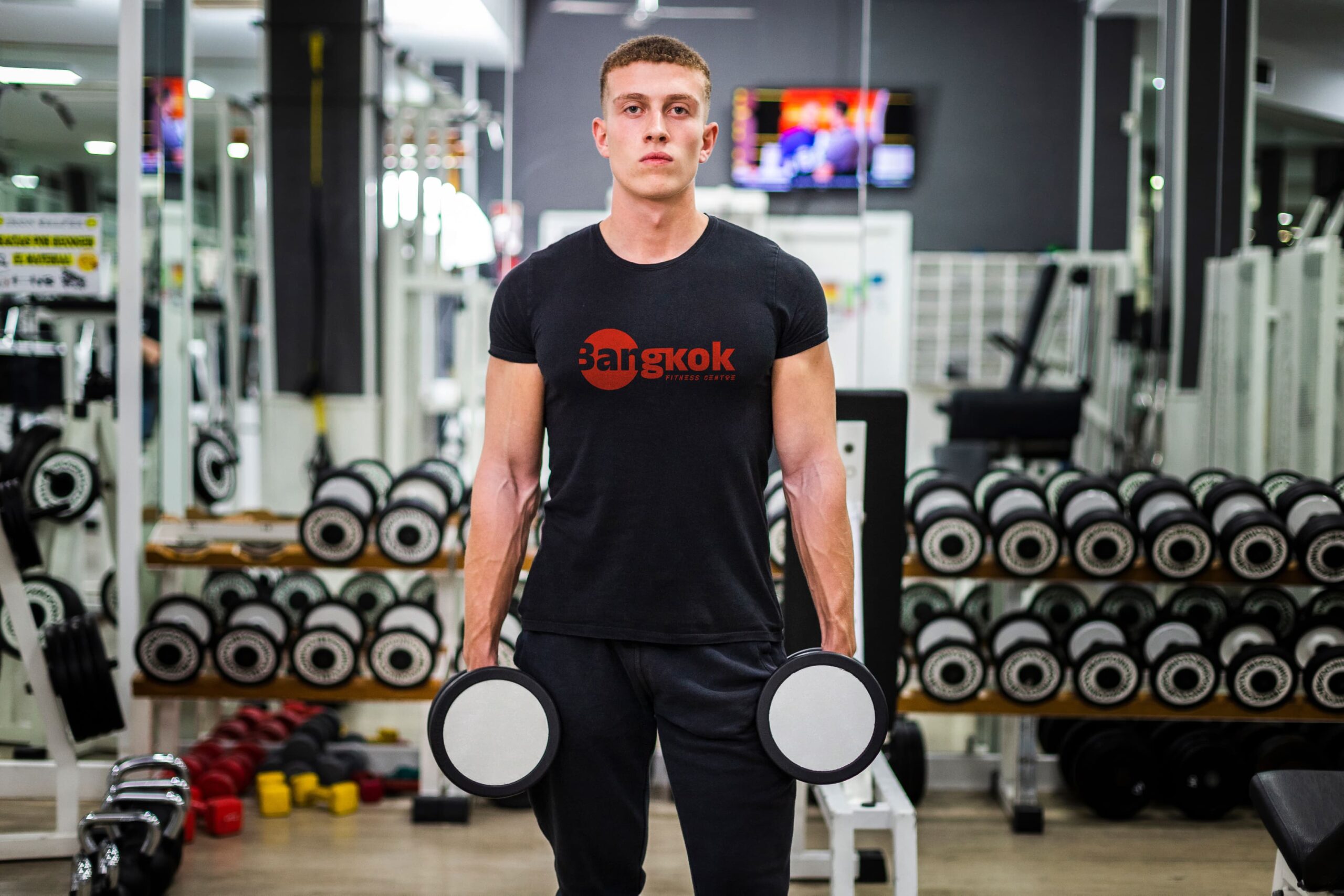
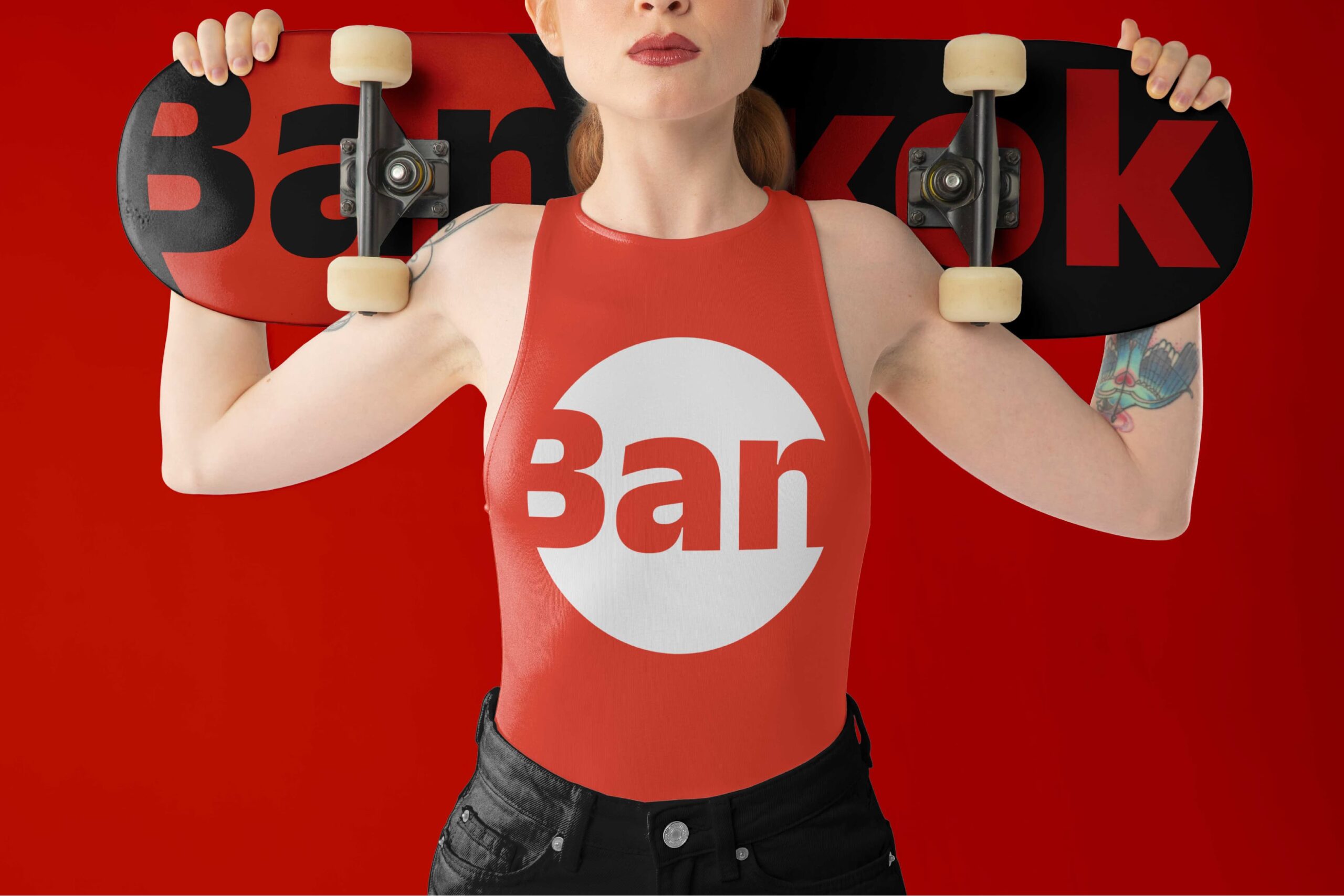
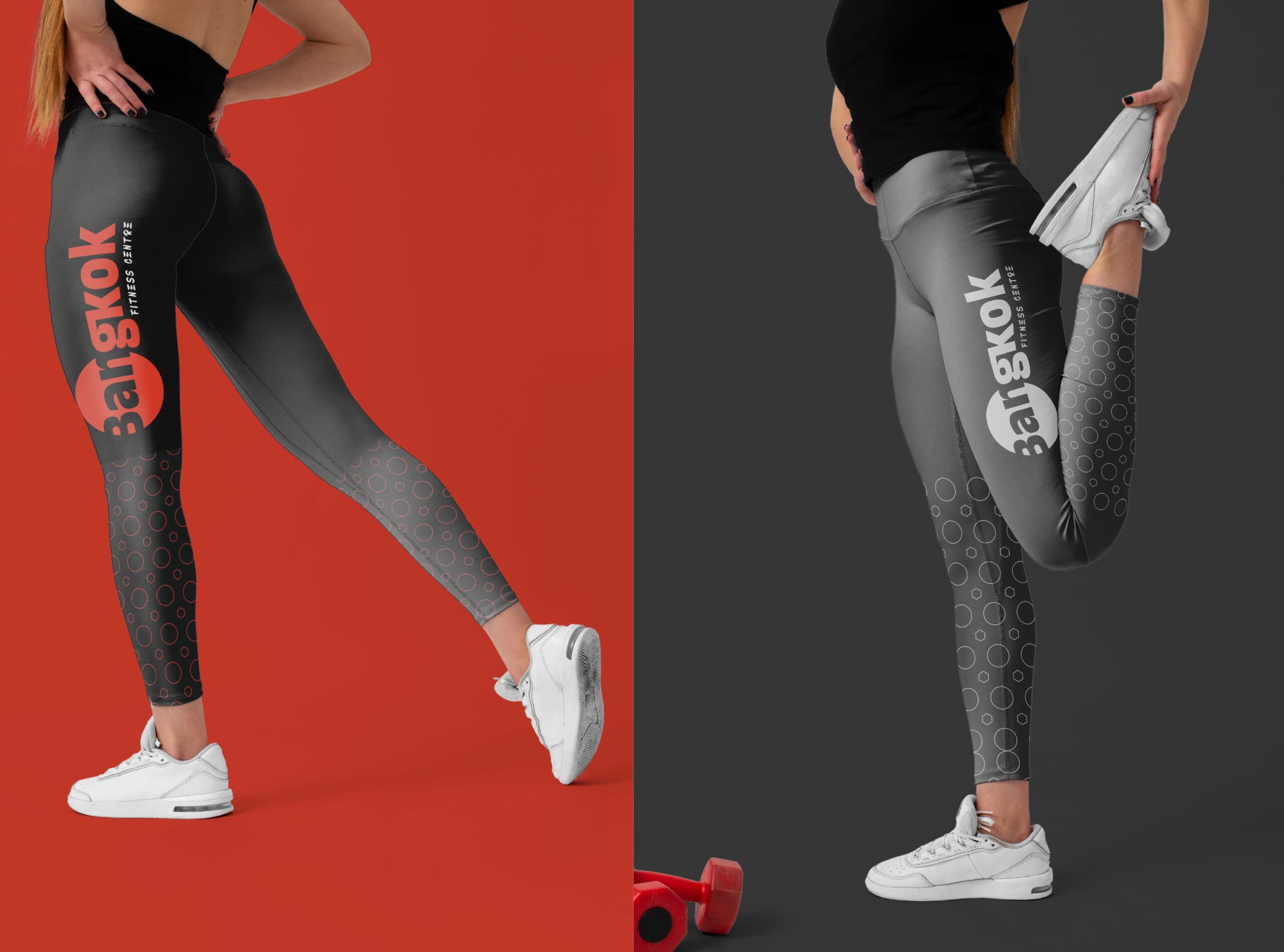
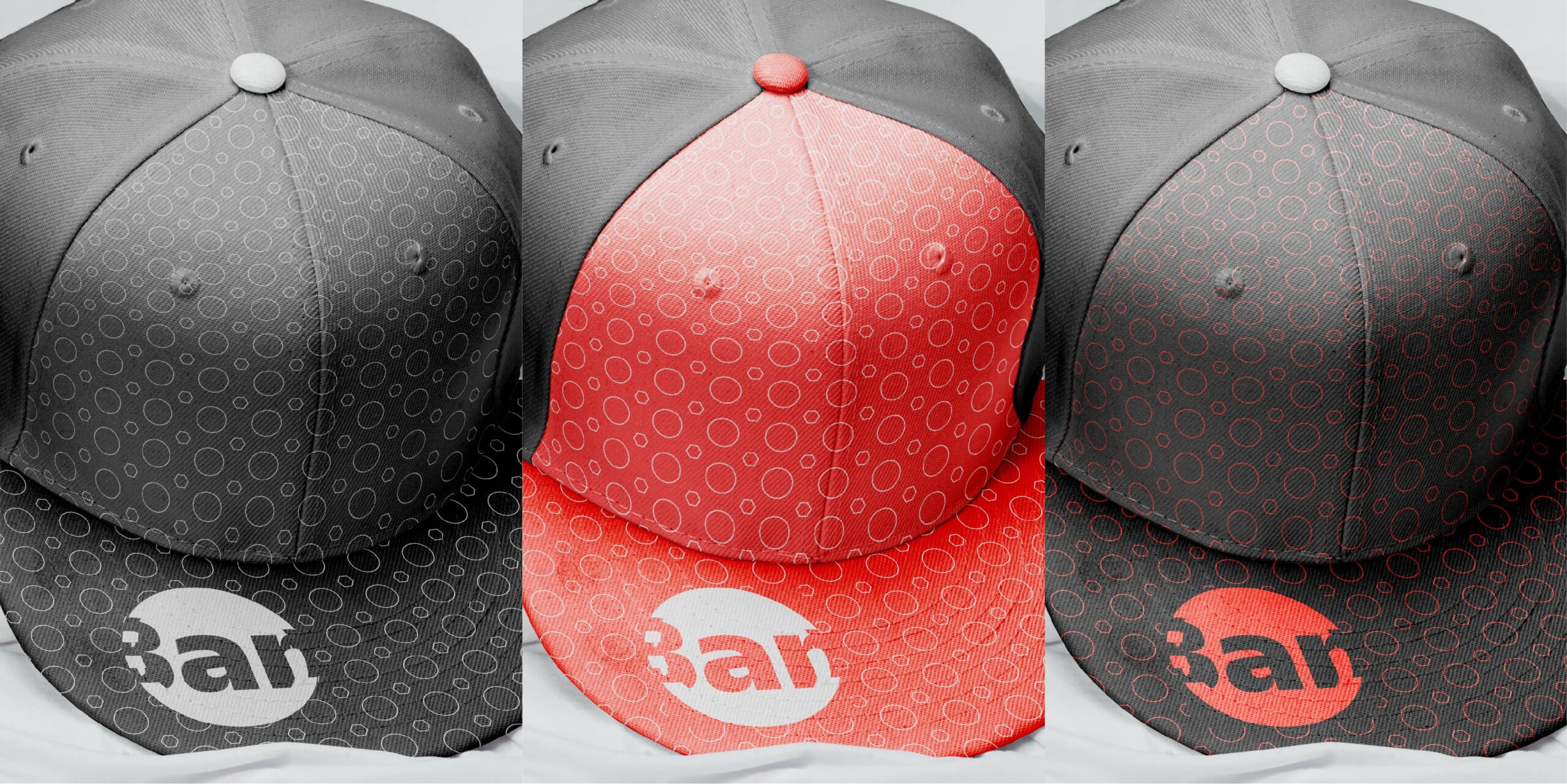
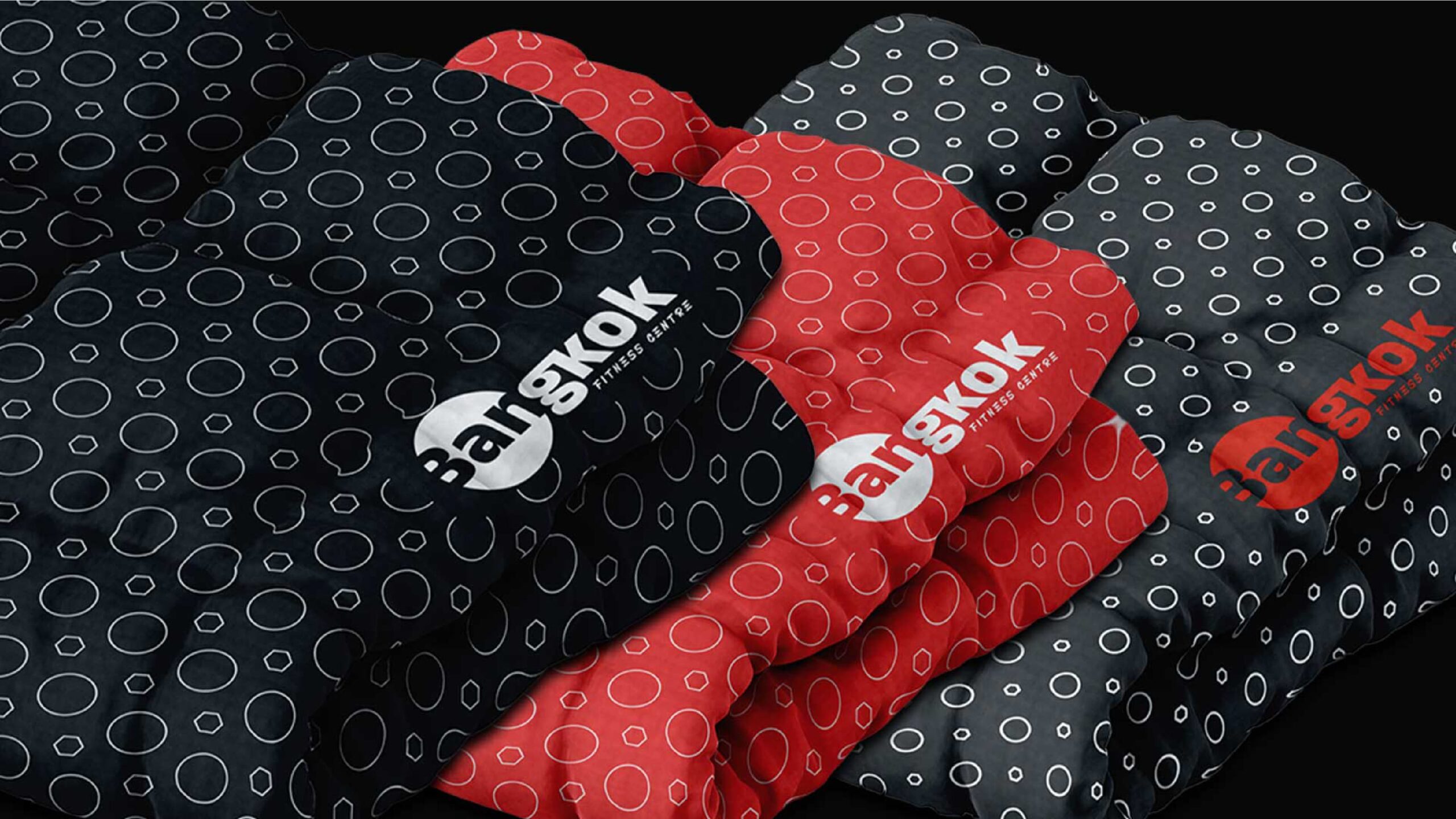
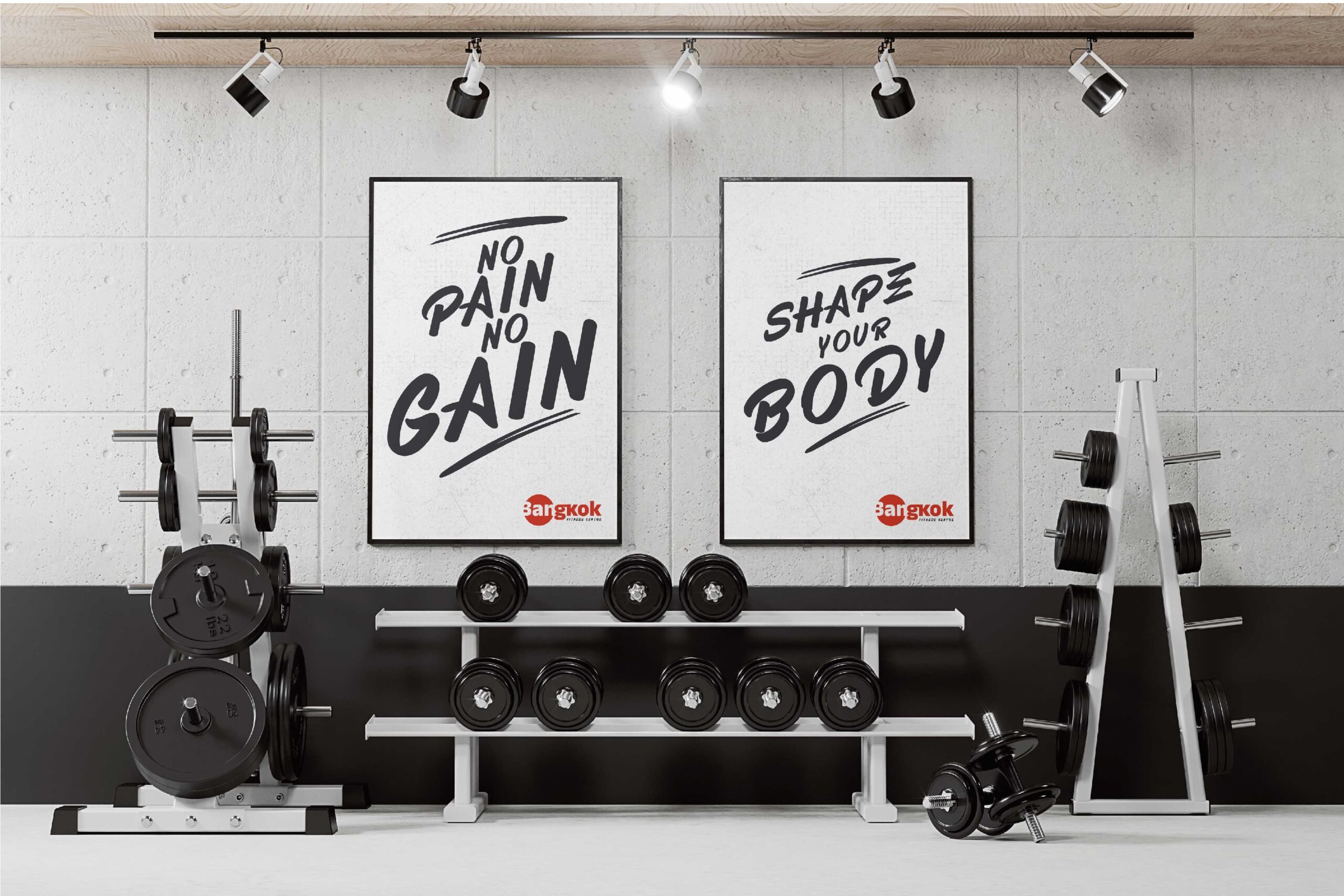
Brand Applications
Client’s Feedback
This year, I decided to take my business to the next level with professional branding. After searching and consulting with multiple companies, I found Toheeb at Privilege Signatures, and I’m thrilled I did! Toheeb’s process was clear, inclusive, and professional. He patiently answered all my questions and allowed me the time to make decisions without feeling rushed. I’m incredibly proud of my new logo and branding, which perfectly captures our identity and goals. Working with Toheeb is a decision you won’t regret. Thank you, Toheeb!”
“Mr Wallace CEO Bangkok Fitness”