As the community continued to grow, it sought a more accommodating venue to foster dialogue, share ideas, and strengthen connections among its members. Consequently, gatherings were relocated to a restaurant near TESCO, providing a conducive environment for engagement and collaboration.
In response to the challenges posed by the pandemic, KAMCOM adapted its approach, envisioning a larger space to accommodate its expanding community. Fast forward to 2024, KAMCOM boasts a membership exceeding 100 individuals
on its WhatsApp group.
Monthly gatherings and annual Eid celebrations serve as pivotal moments for KAMCOM members to convene, not only for socialization but also for educational purposes. These occasions offer a platform to impart Islamic knowledge, nurture camaraderie, and cultivate a sense of cultural identity among attendees, including the younger generation, ensuring they are immersed in the rich Islamic heritage and values.
Vision Statement
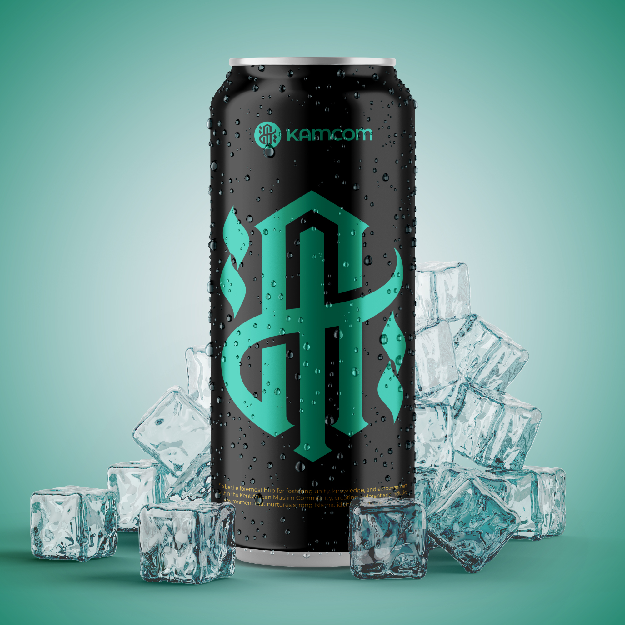
To be the foremost hub for fostering unity, knowledge, and empowerment within the Kent African Muslim Community, creating a vibrant and inclusive environment that nurtures strong Islamic identity and enriches lives.
Mission Statement
Our mission is to cultivate a supportive network where members of the Kent African Muslim Community can gather regularly to exchange ideas, share experiences, and deepen their understanding of Islam. Through engaging activities, educational initiatives, and community outreach, we strive to empower individuals, strengthen familial bonds, and instill a sense of pride in our cultural heritage. Together, we aim to foster a cohesive community that embraces diversity, promotes social cohesion, and contributes positively to society.
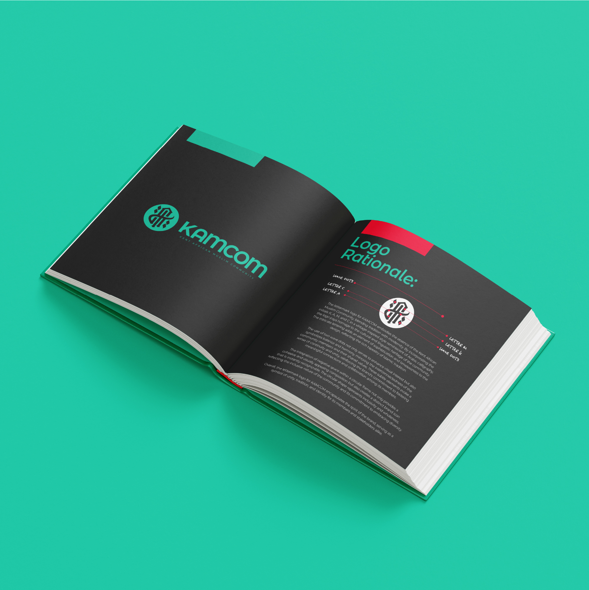
Logo Rationale
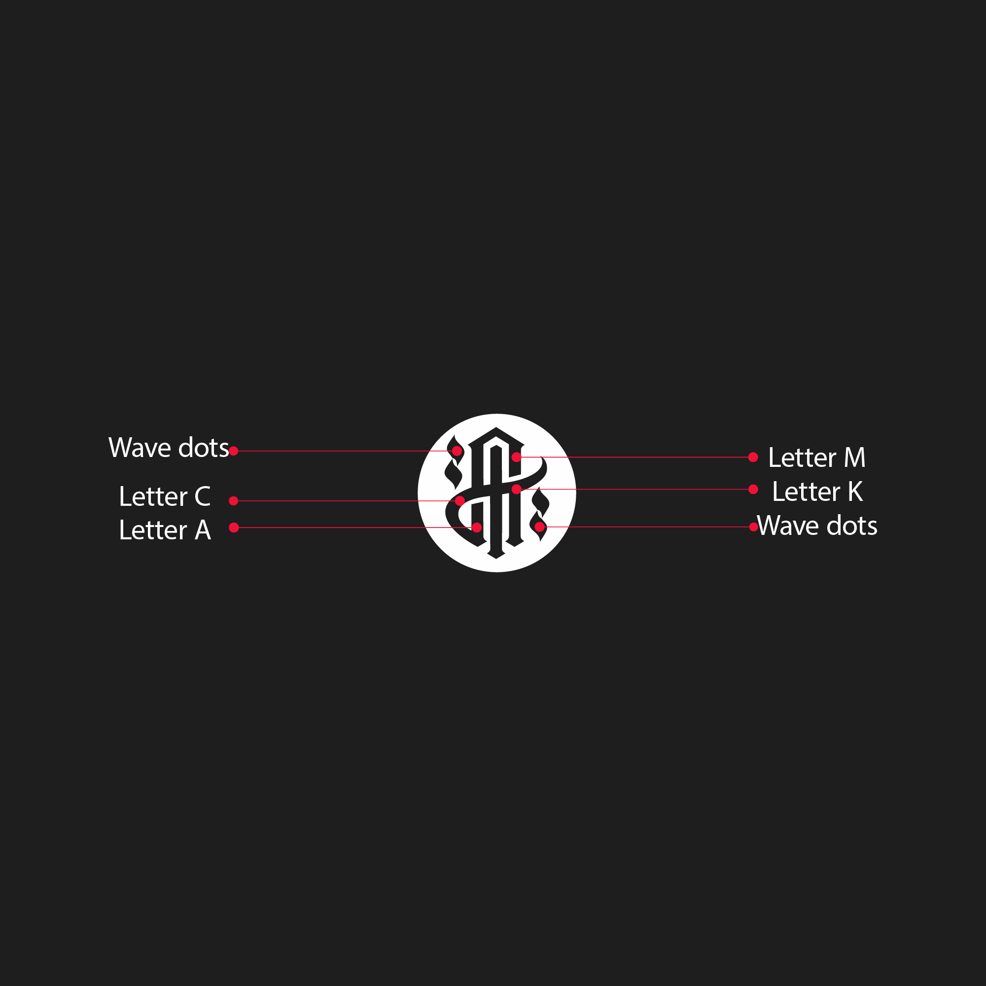
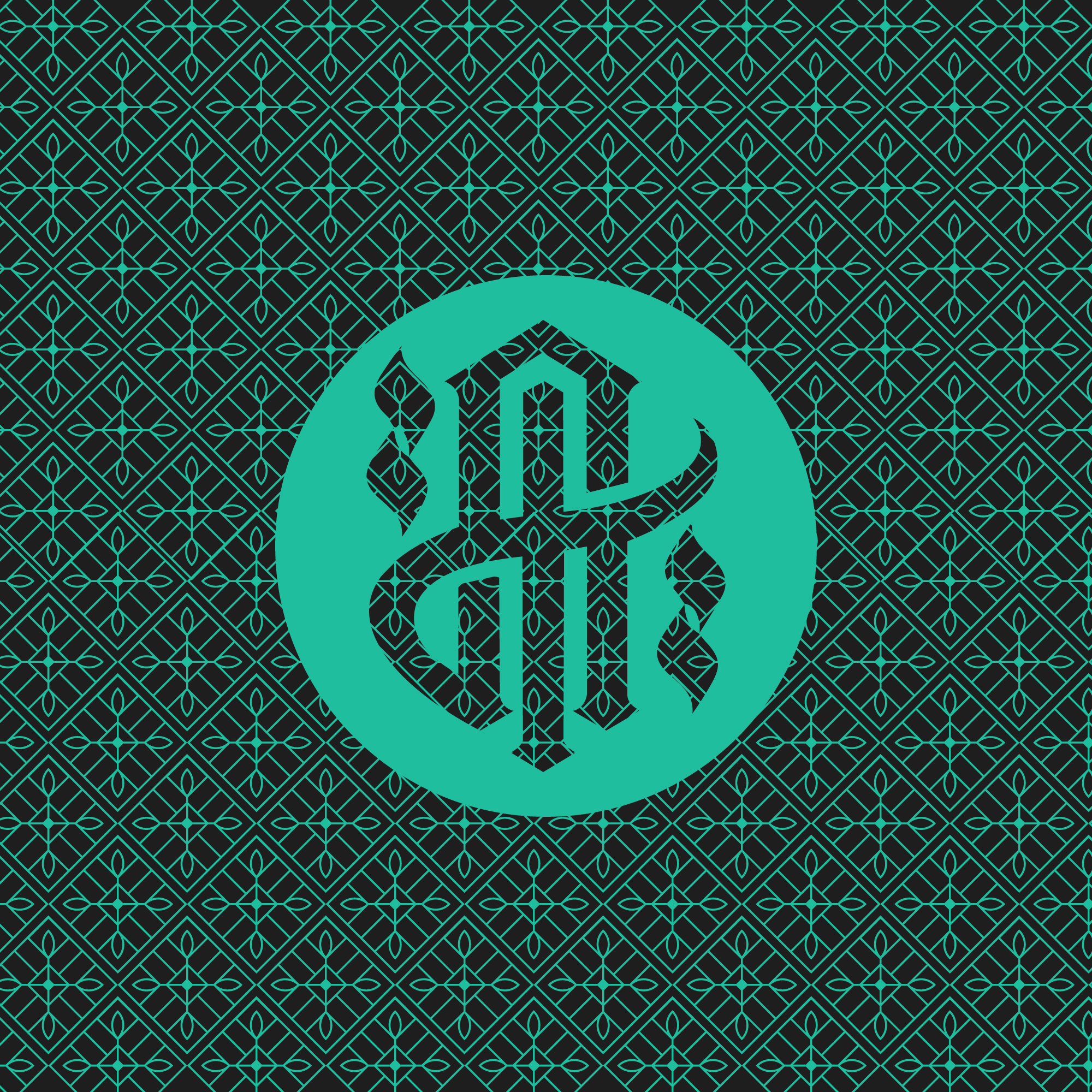
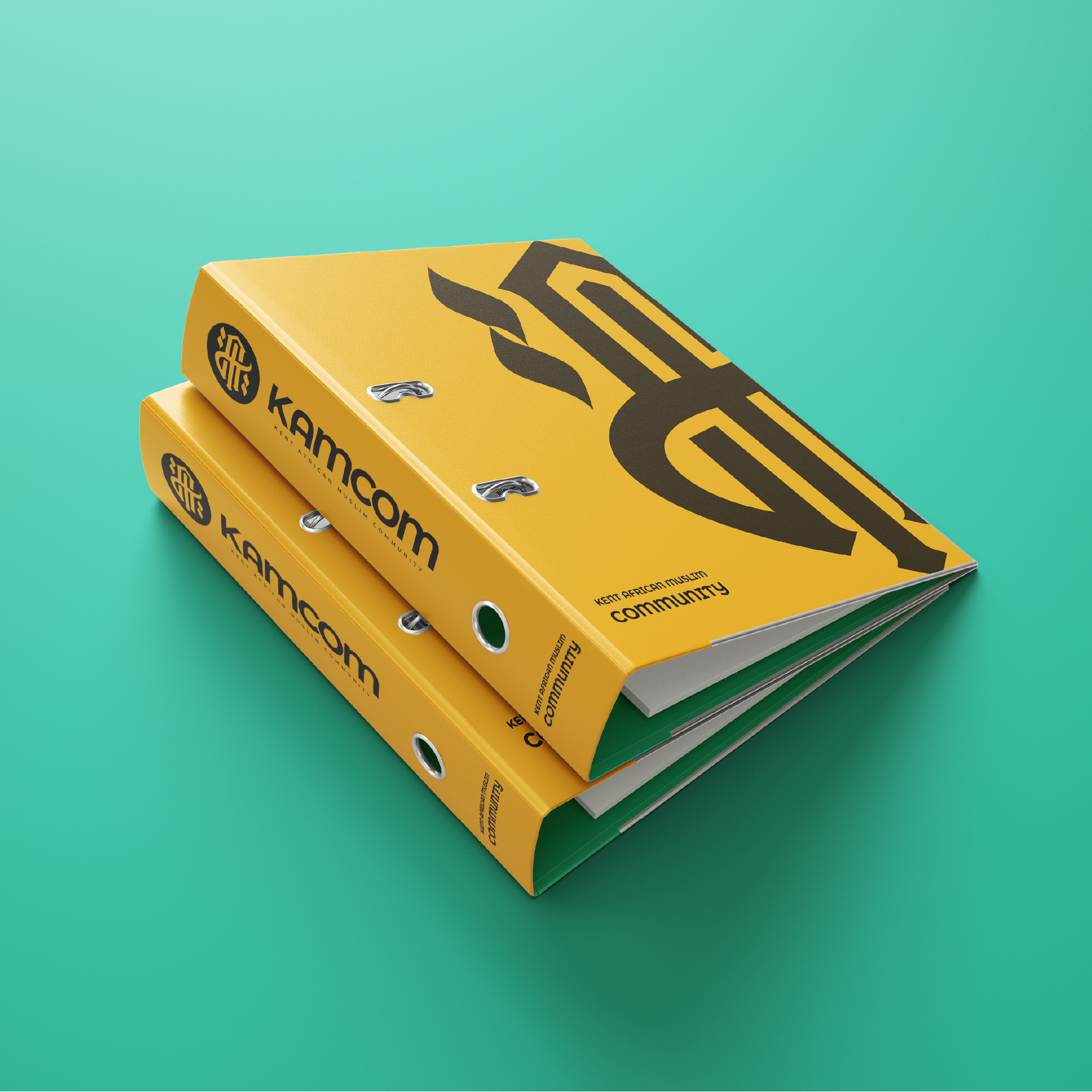
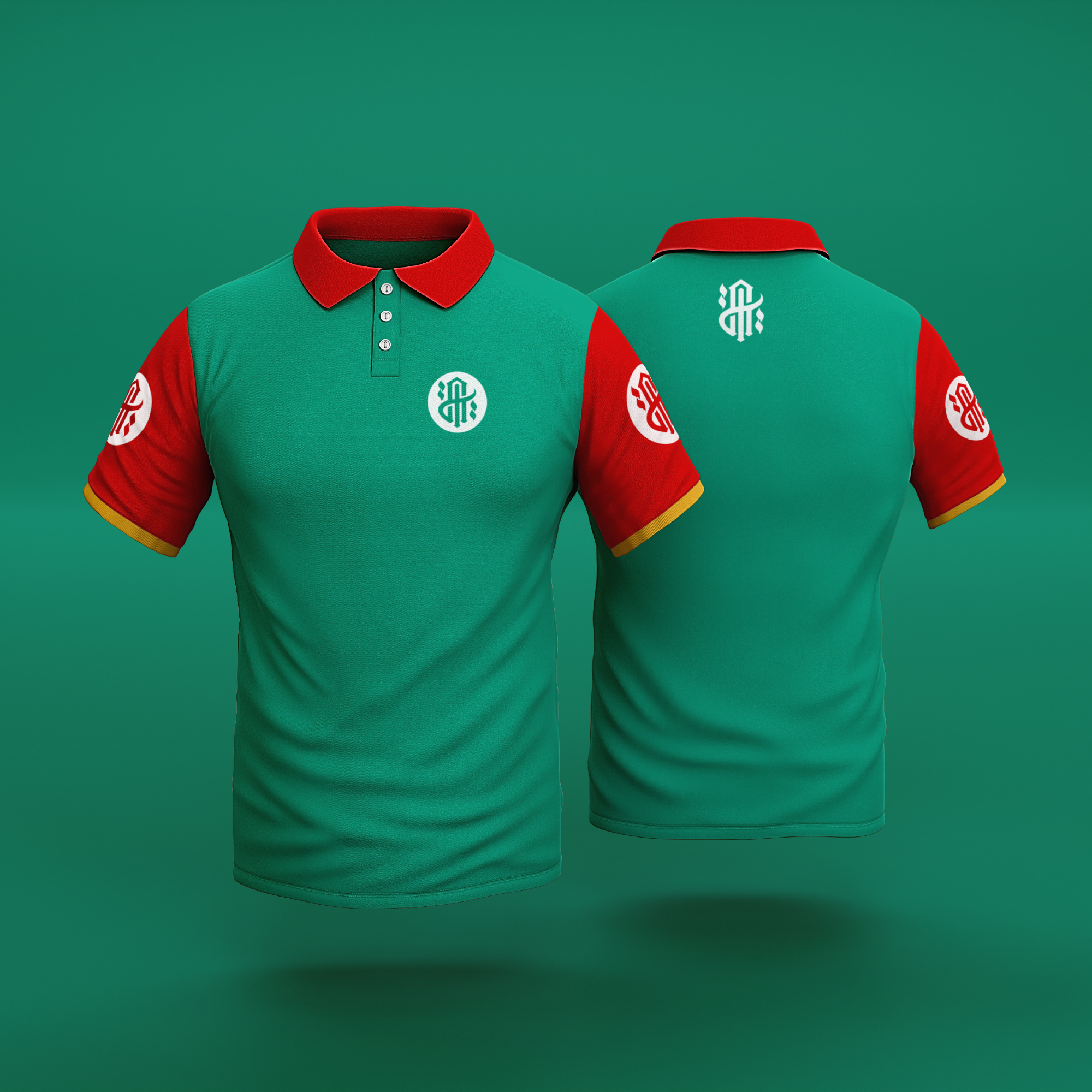
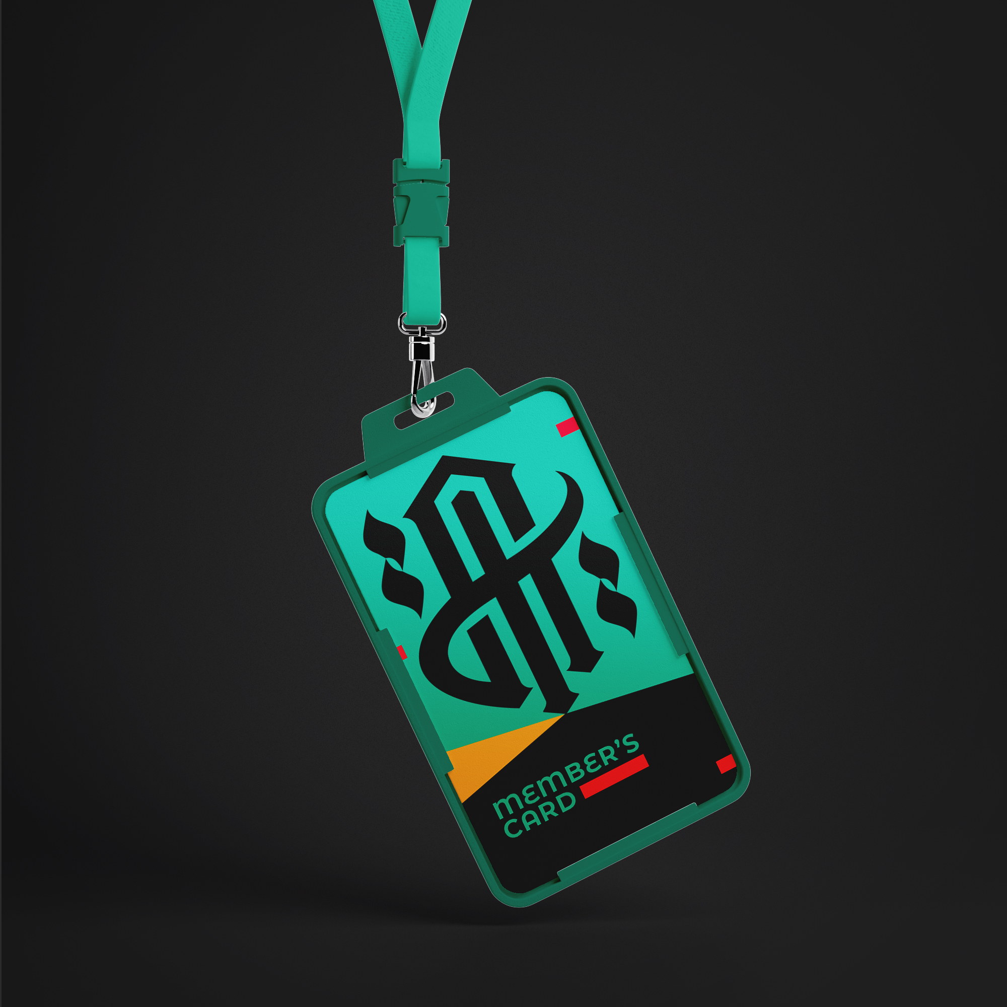
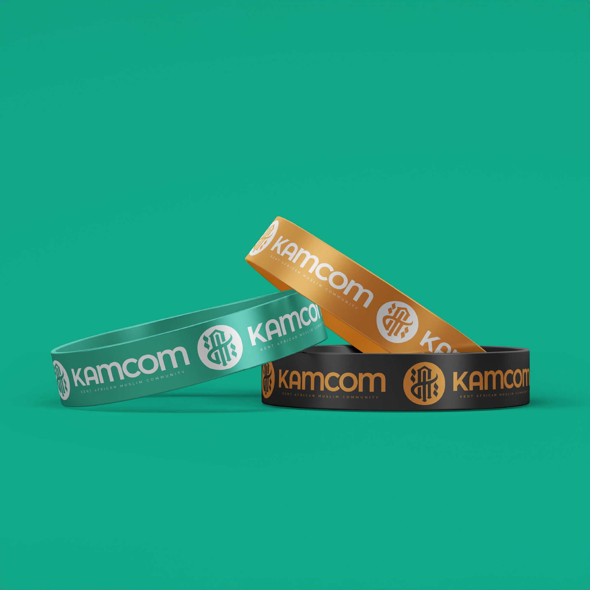
The lettermark logo for KAMCOM embodies the essence of the Kent African Muslim Community, blending tradition with modernity. By incorporating the initials K, A, M, and C in a vintage-inspired style reminiscent of Arabic calligraphy, the logo pays homage to the cultural and linguistic heritage of the community. The intricate lettering adds an element of sophistication and timelessness to the design, reflecting the rich tapestry of Islamic tradition.
The use of two wave dots not only serves to enhance visual interest but also symbolizes balance and harmony, mirroring the interconnectedness of the community members and their shared values. These subtle elements evoke a sense of continuity and unity, reinforcing the brand’s commitment to fostering meaningful connections and collaboration among its members.
The integration of negative space within a circular frame not only provides a cohesive and visually appealing composition but also creates a distinct brand icon that is instantly recognizable. The circular shape represents inclusivity and wholeness, reflecting the inclusive nature of the community and its commitment to embracing diversity.
Overall, the lettermark logo for KAMCOM encapsulates the spirit of the brand, serving as a symbol of unity, tradition, and identity for its members and stakeholders alike.
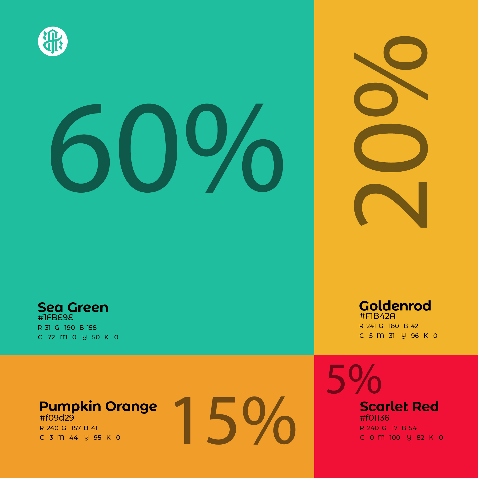
Why Sea Green?
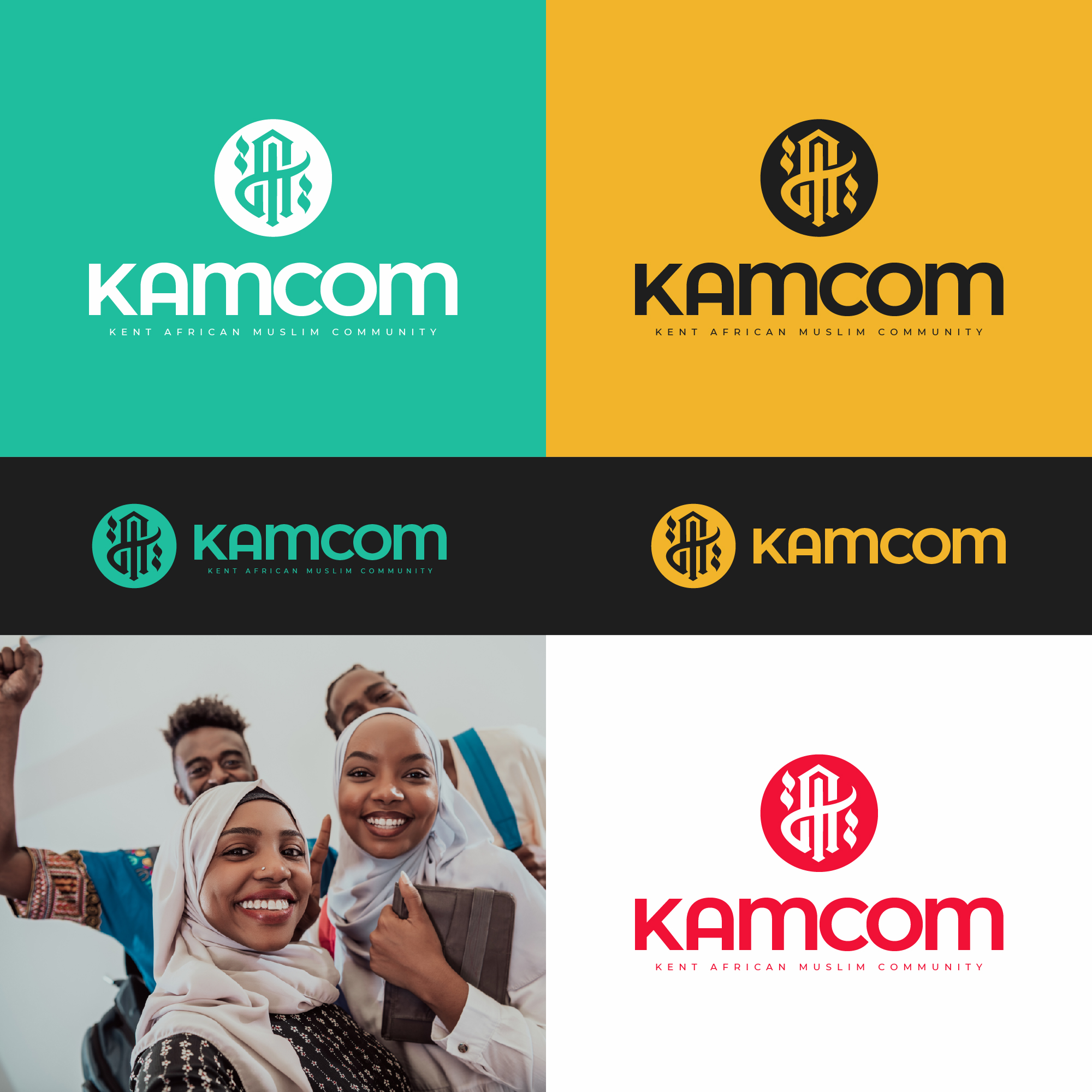
Sea Green evokes the lush landscapes of Africa, symbolizing growth and vitality, while embodying the harmony and renewal found in the continent’s natural beauty.
Why Goldenrod?
Goldenrod reflects the warmth of the African sun and the richness of its landscapes, symbolizing prosperity and cultural heritage deeply ingrained in African societies.
Why Pumpkin Orange?
Pumpkin Orange radiates energy and vibrancy, mirroring the zest for life and celebration inherent in African culture and traditions.
Why Scarlet Red?
Scarlet Red signifies strength, courage, and resilience, embodying the enduring spirit and cultural identity of African communities across generations.
