Logo Rationale
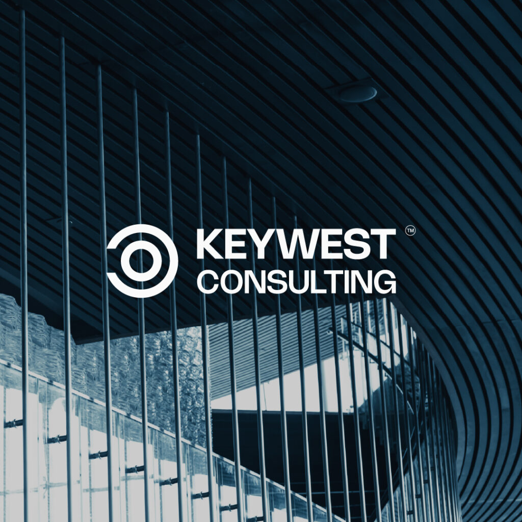
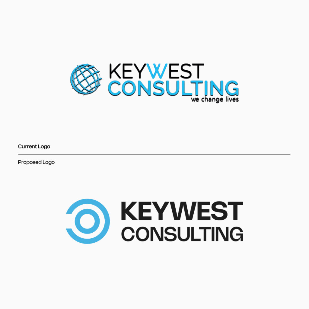
The logo for Keywest Consulting is a deliberate fusion of symbolism and modern design crafted to visually represent the essence of the company’s mission and values. Here’s the rationale behind the design
Western Momentum
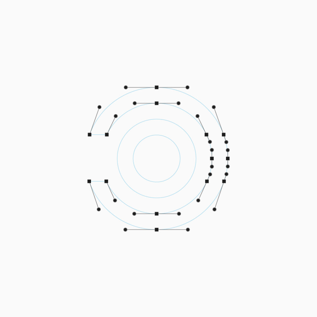
The west-facing letter “C” serves as a powerful symbol of progress and forward-thinking. Positioned to face west, it embodies the company’s commitment to guiding clients towards future success. This directional element represents a journey, aligning with the firm’s role as a consulting partner navigating clients through strategic paths and opportunities.
Central Unity
At the heart of the logo, a perfectly centered circle symbolizes unity, collaboration, and a key focal point. This central element highlights the core values of KeyWest Consulting bringing together expertise, knowledge, and solutions to create a unified and impactful approach to consulting.
Integration And Balance
The seamless integration of the west-facing “C” and the central circle creates balanced and cohesive design. The careful placement and proportionality of these elements contribute to a visually pleasing and memorable logo.
Versatility And Scalability
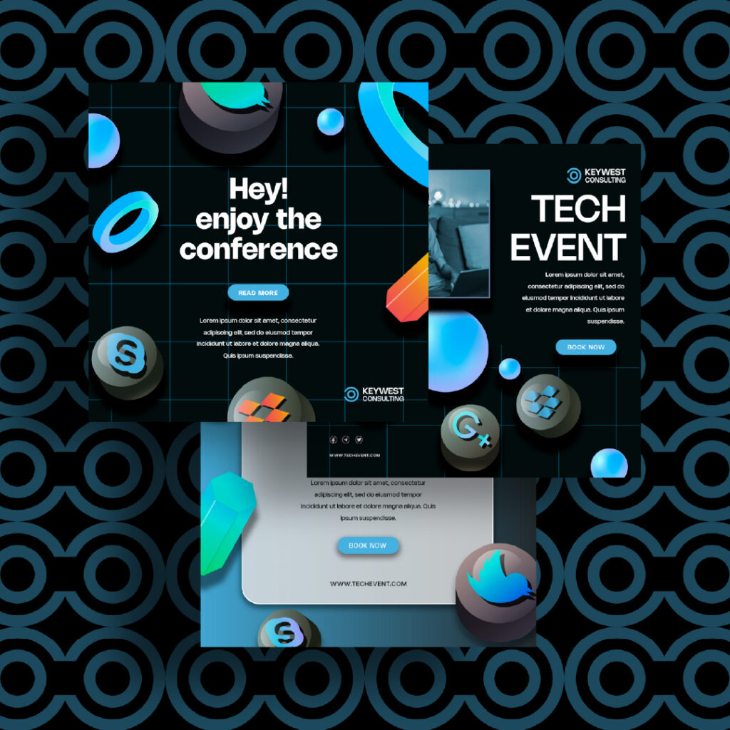
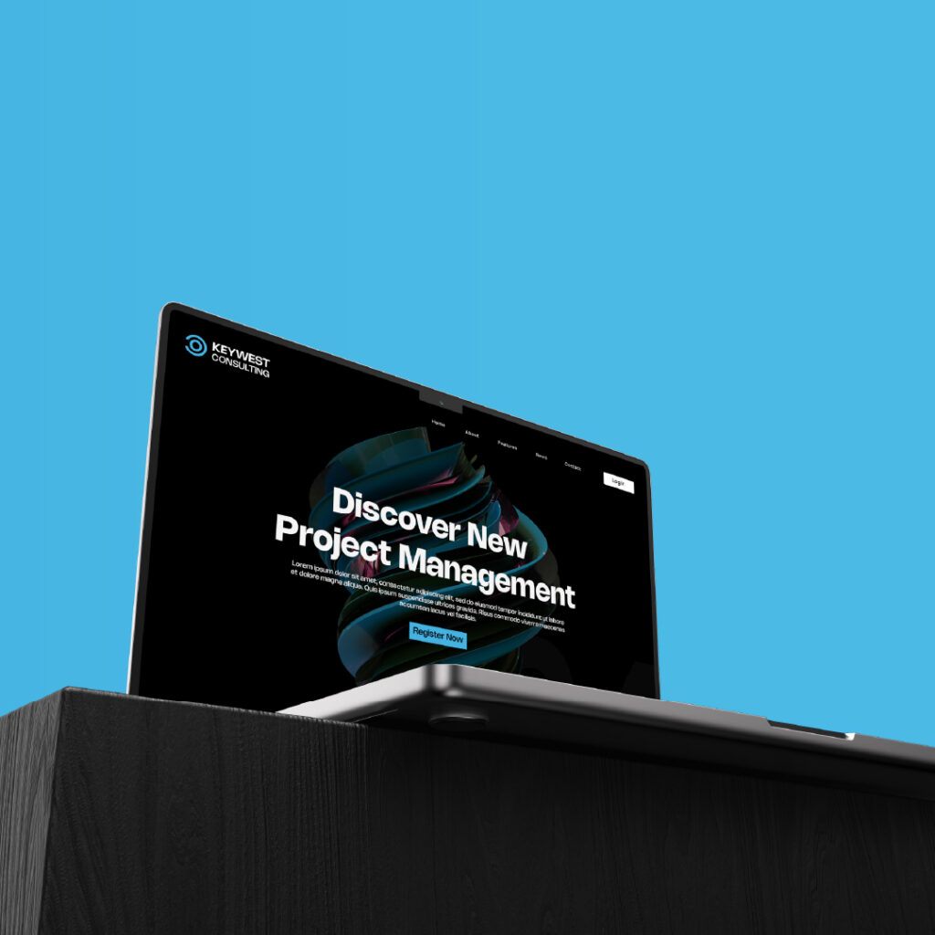
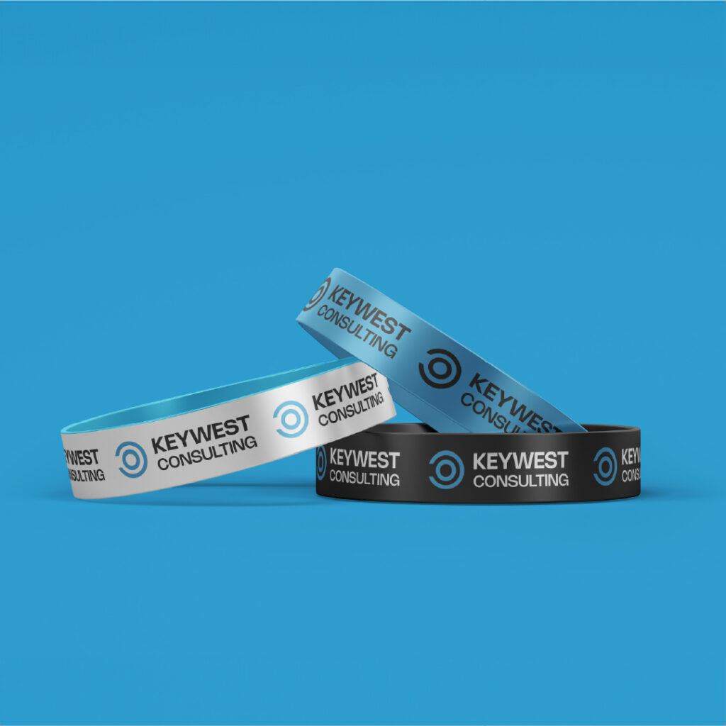
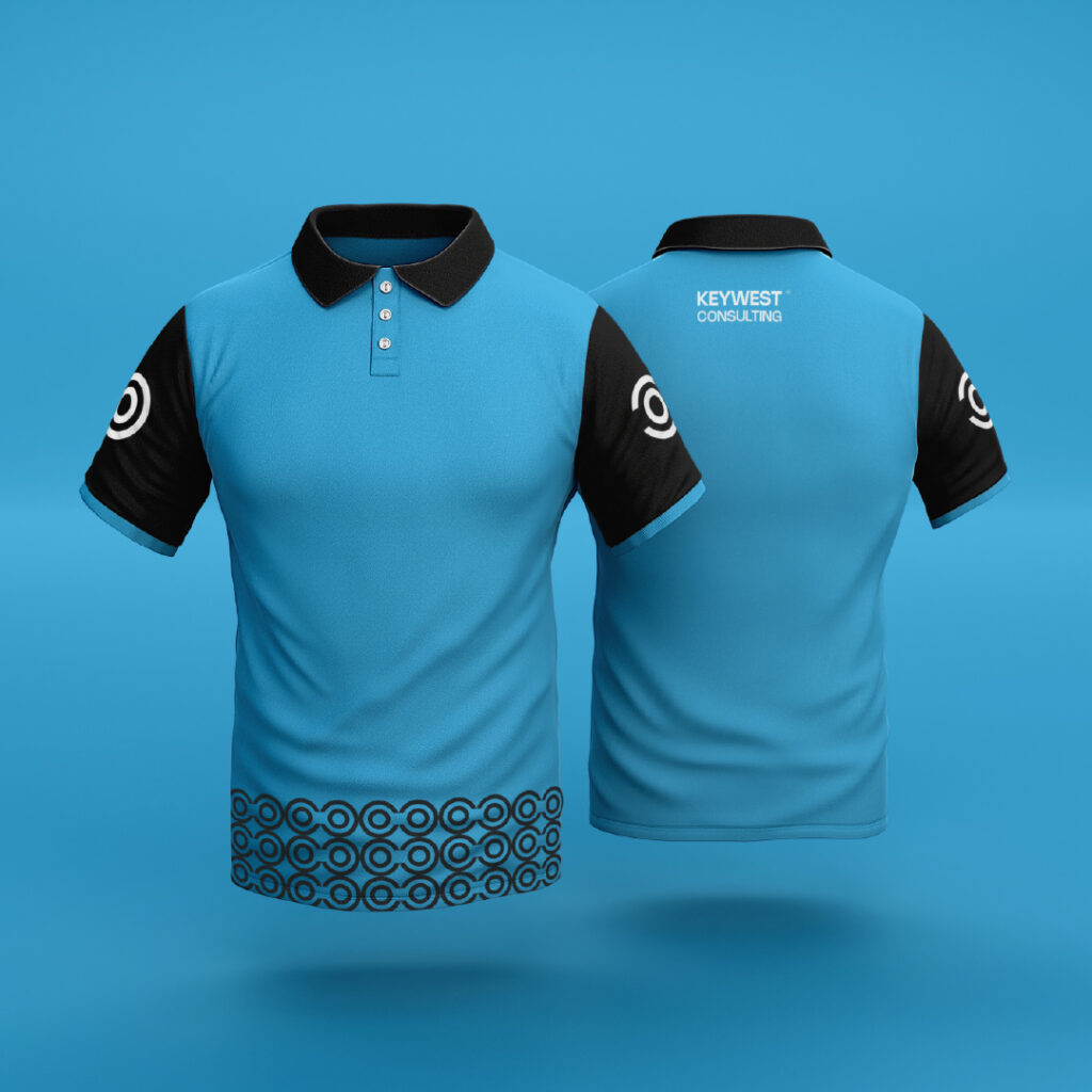
The logo has been crafted with versatility in mind, its scalability allows it to maintain clarity and impact accross various platforms to print media. This adaptability ensures a consistent and recognizable brand presence.
In summary, the Keywest Consulting Firm logo is a thoughtful representation of the company’s values, expertise, and commitment to guiding clients towards success with a modern, professional and forward-thinking approach.
